Final Poster
The final poster includes intentional flaws and offset colors to mimic a traditional poster print process.
Process
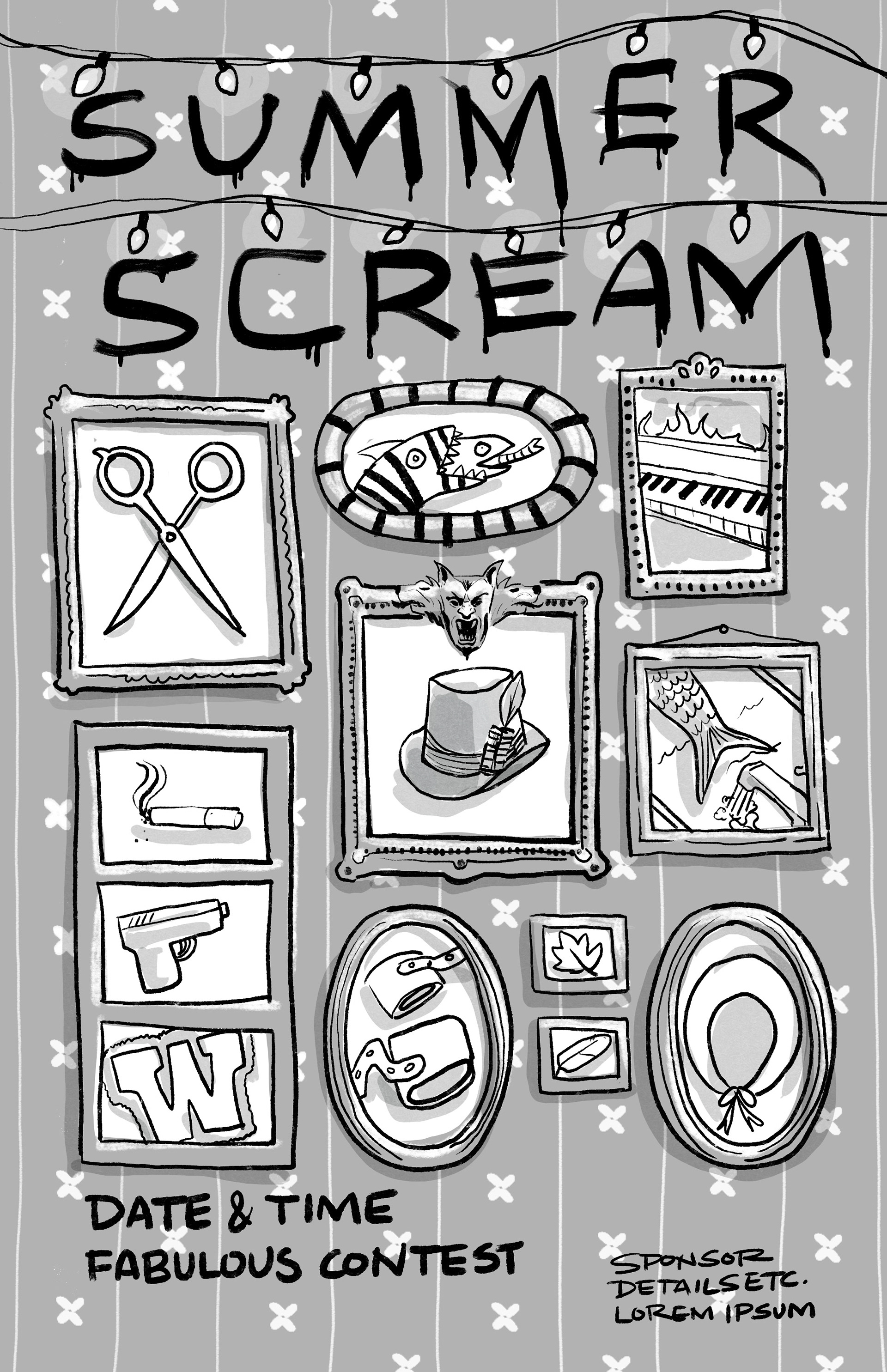
The initial project was communicated to me by the client (an event coordinator) as a single poster for a summer event at Lakeside Amusement Park, an historic park in Denver, Colorado. The event was sponsored by Denver Film and the theme was Winona Ryder. These are initial sketches and ideas. The Love & Rockets cover was the concept that the client first asked for, the other sketches were my original ideas.
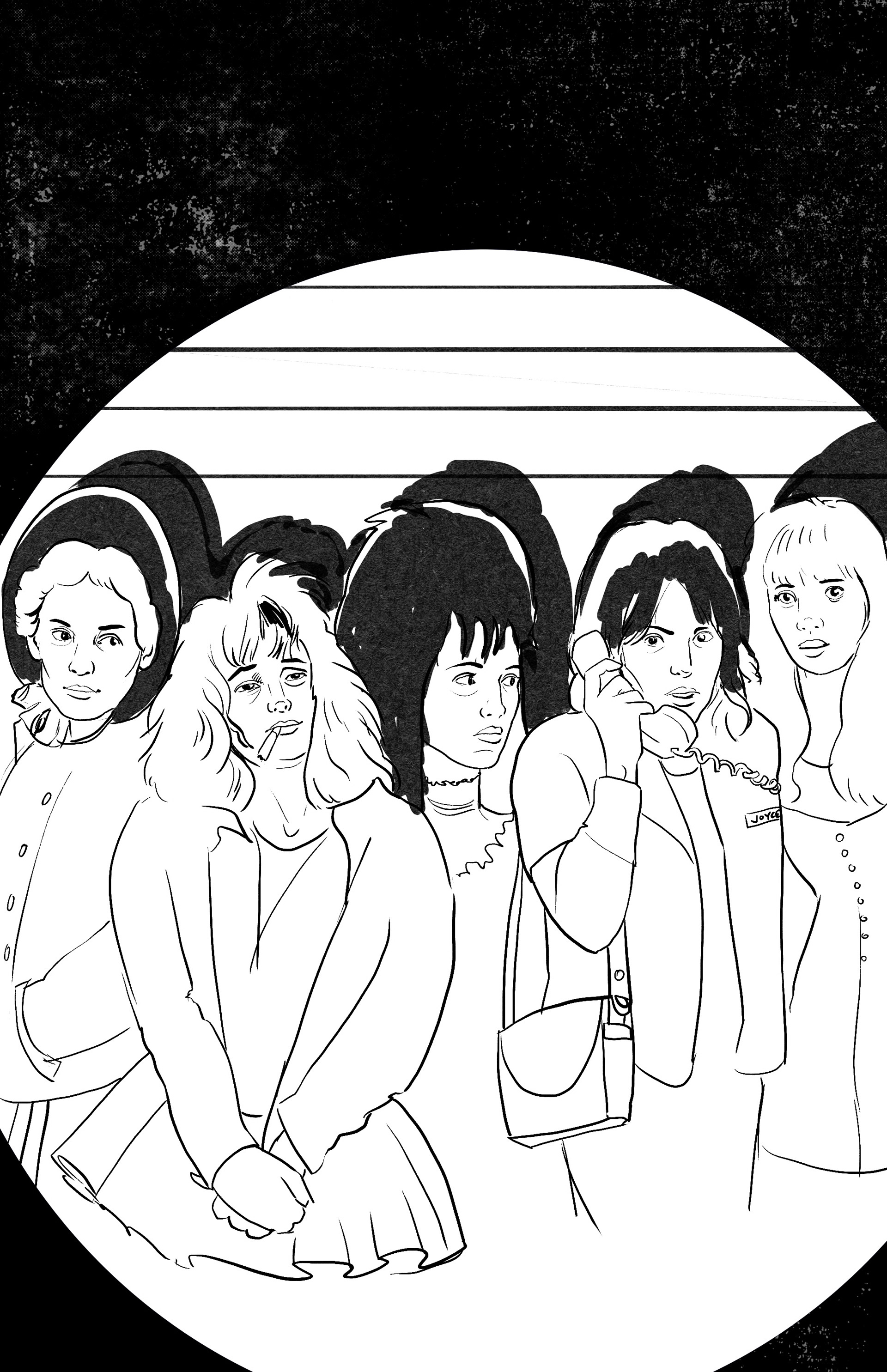
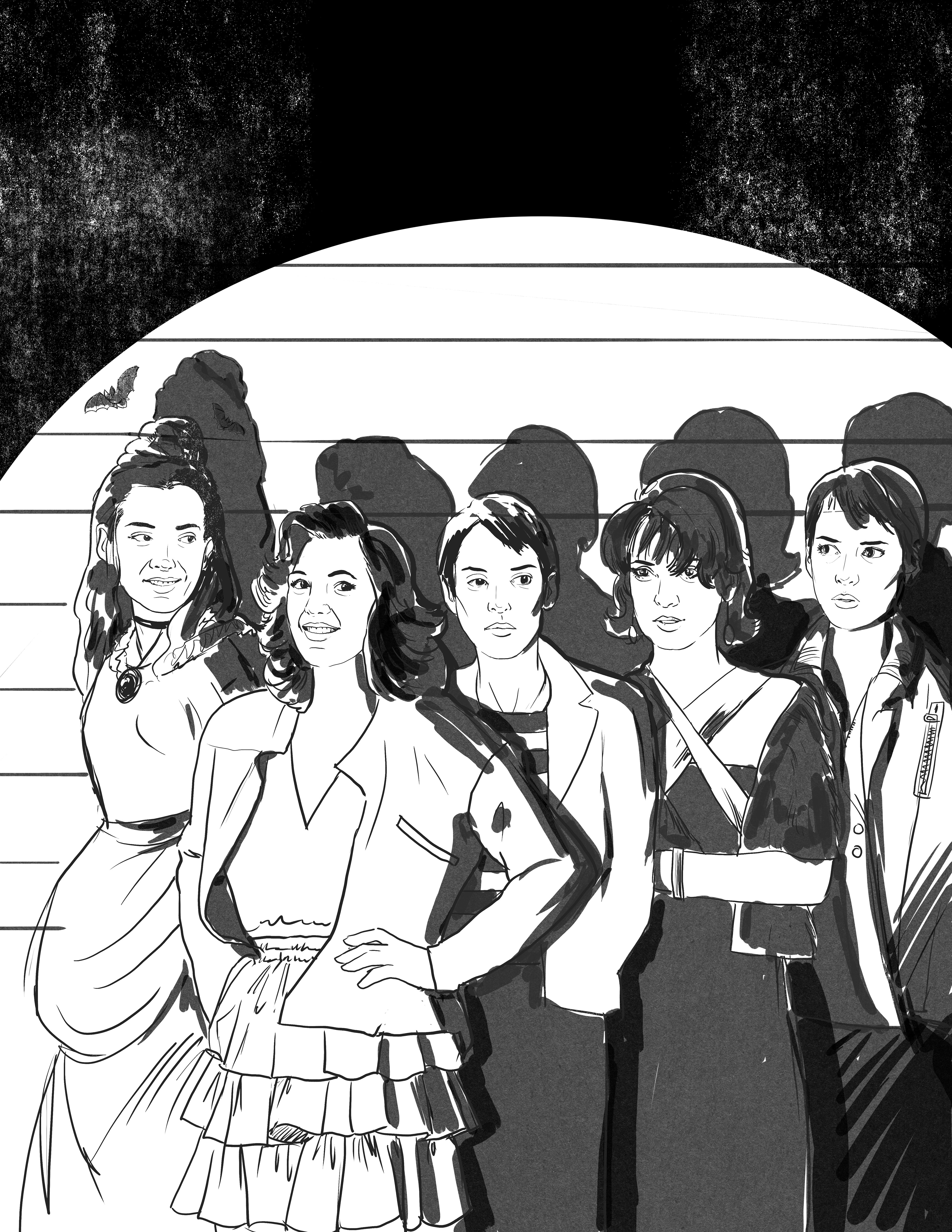
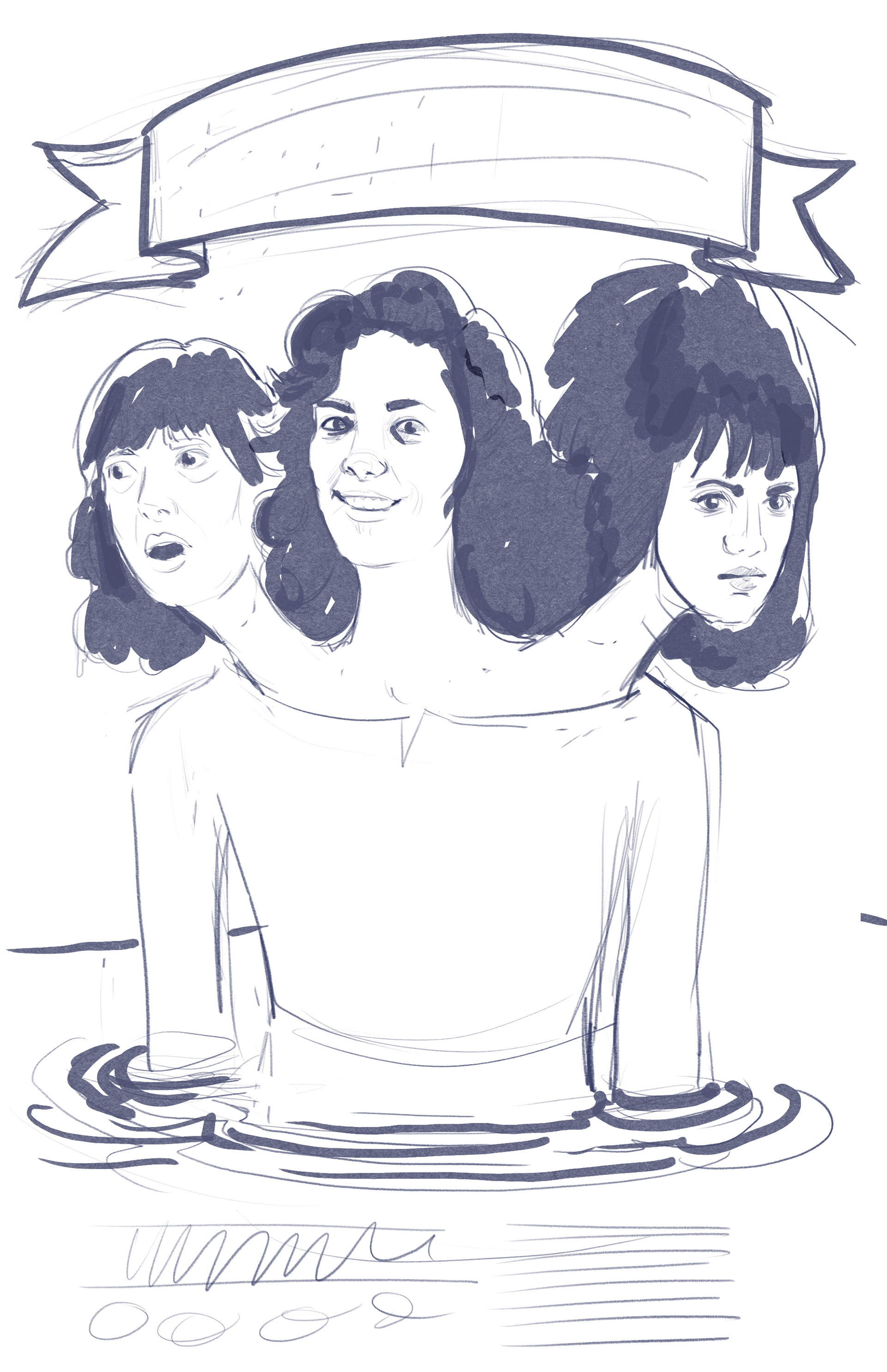
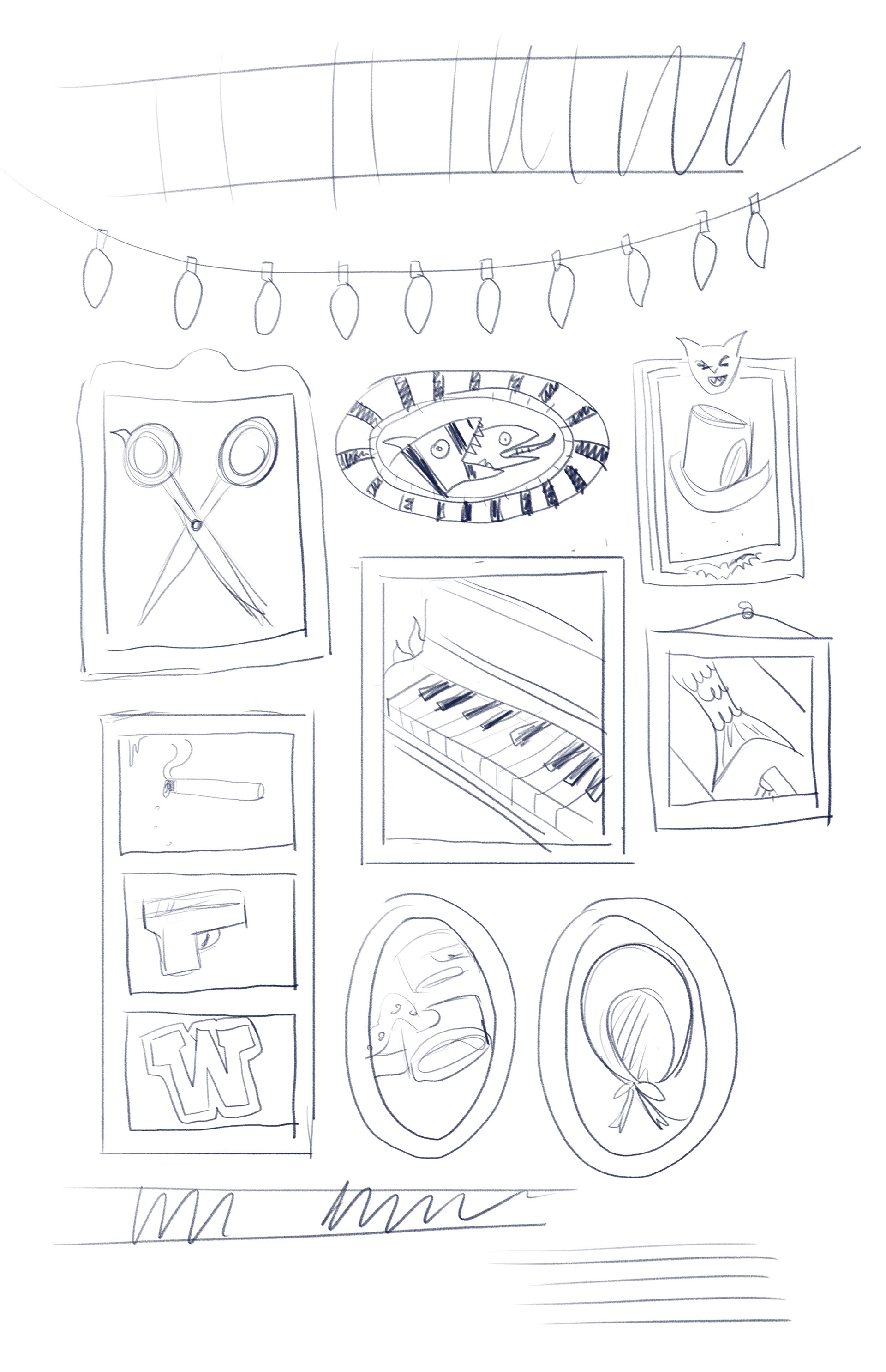
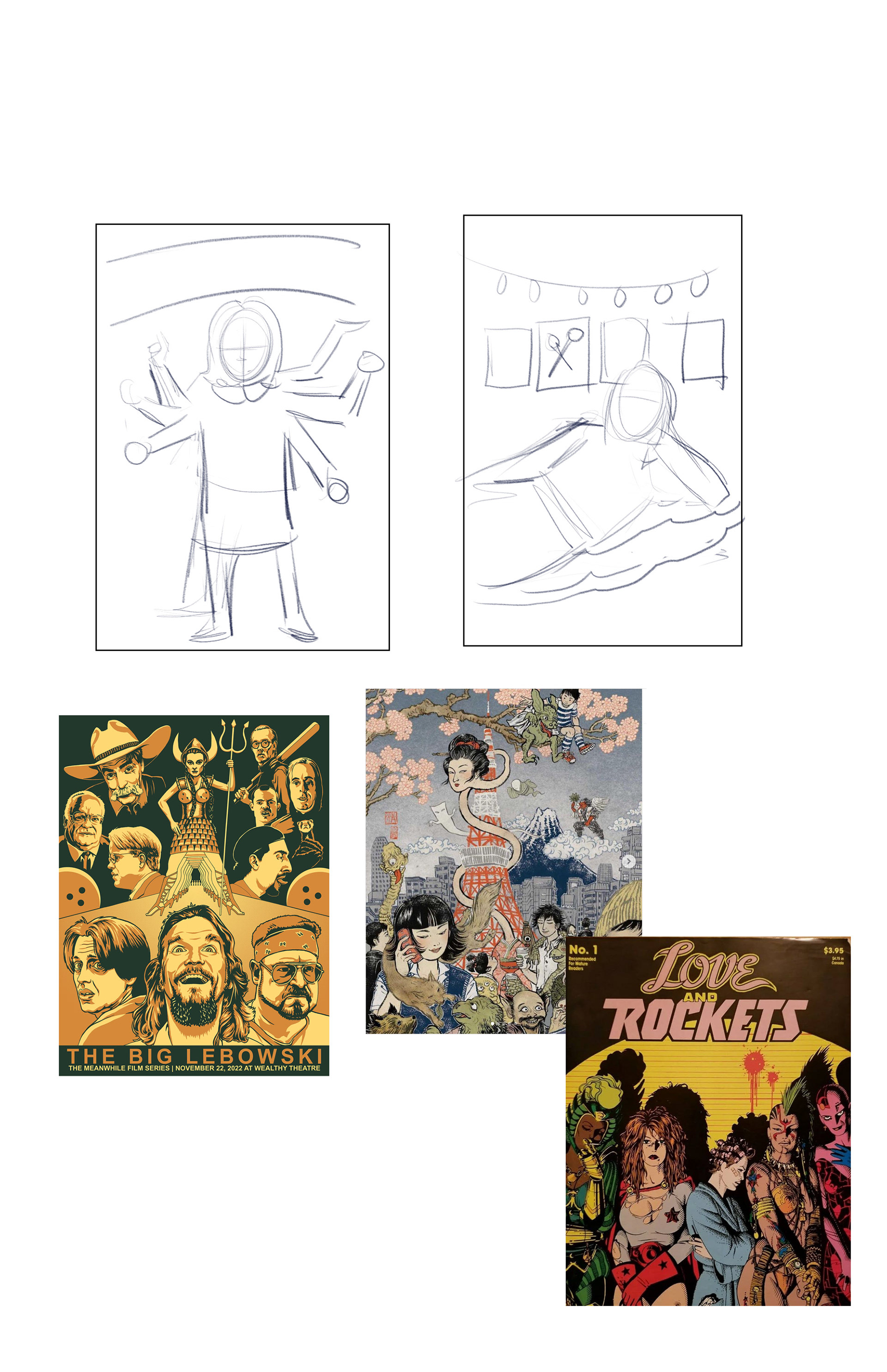
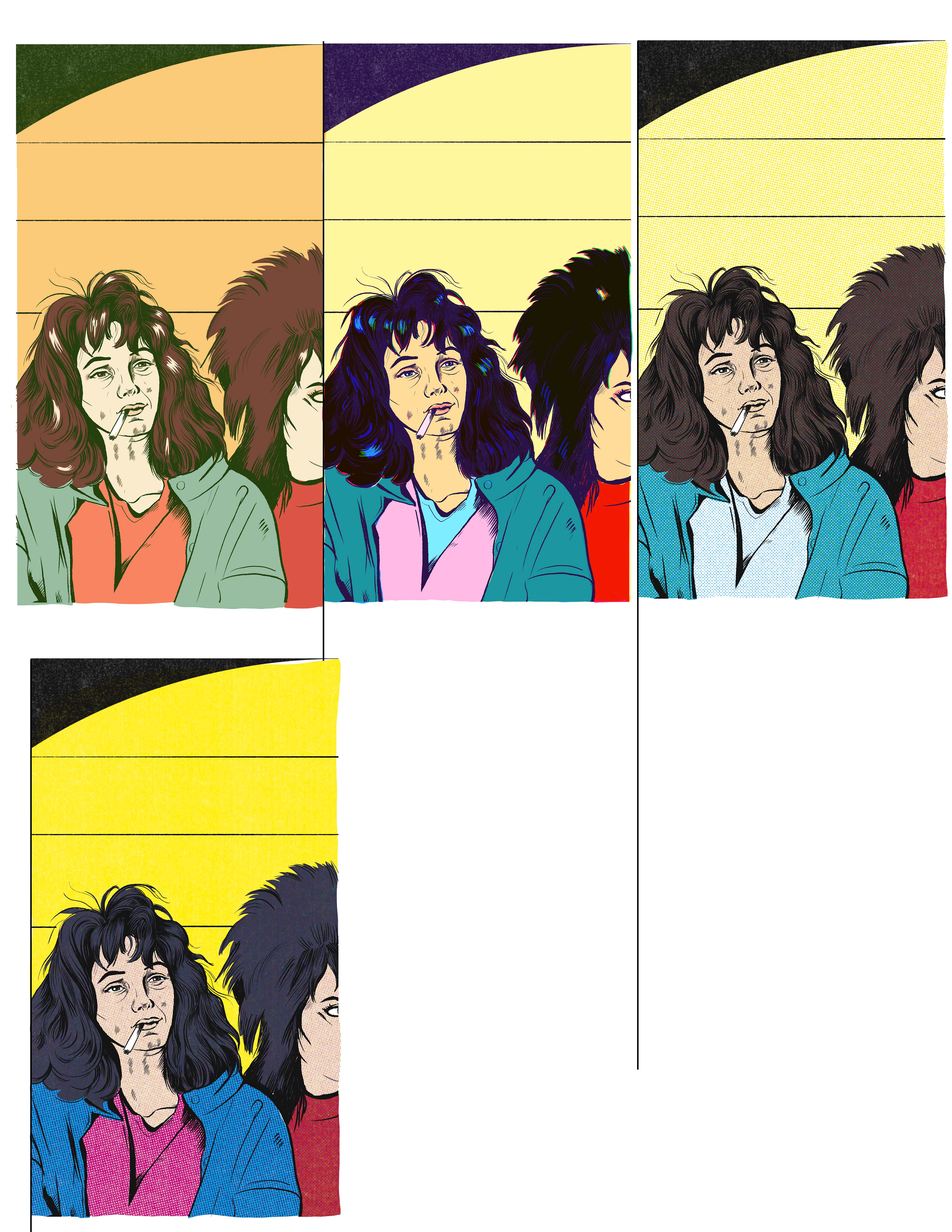
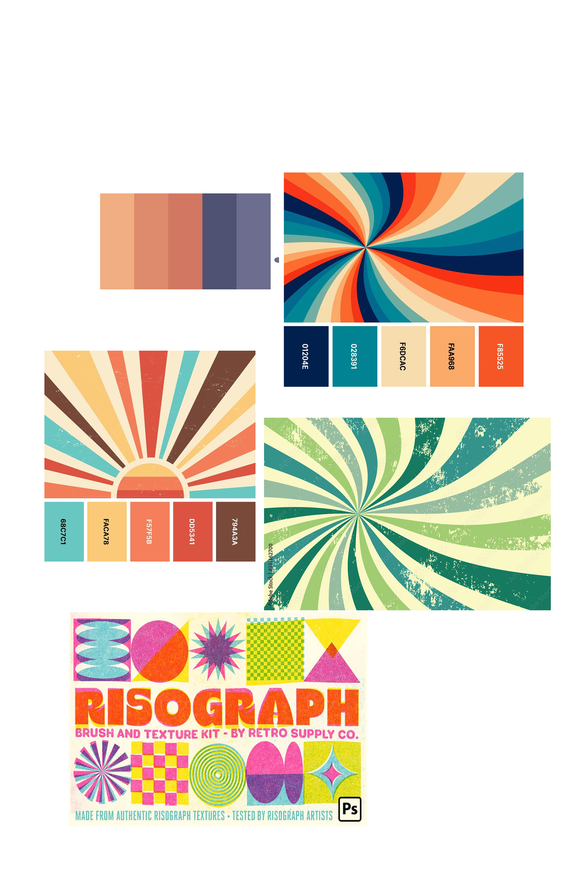
The client liked all of these ideas and asked me to work them up into slightly tighter versions to present to the park, along with some layout and palette examples. They wanted to highlight their favorite —the comic book cover version— so I used that as an example of the clients preferred palette, plus some other suggested palettes.
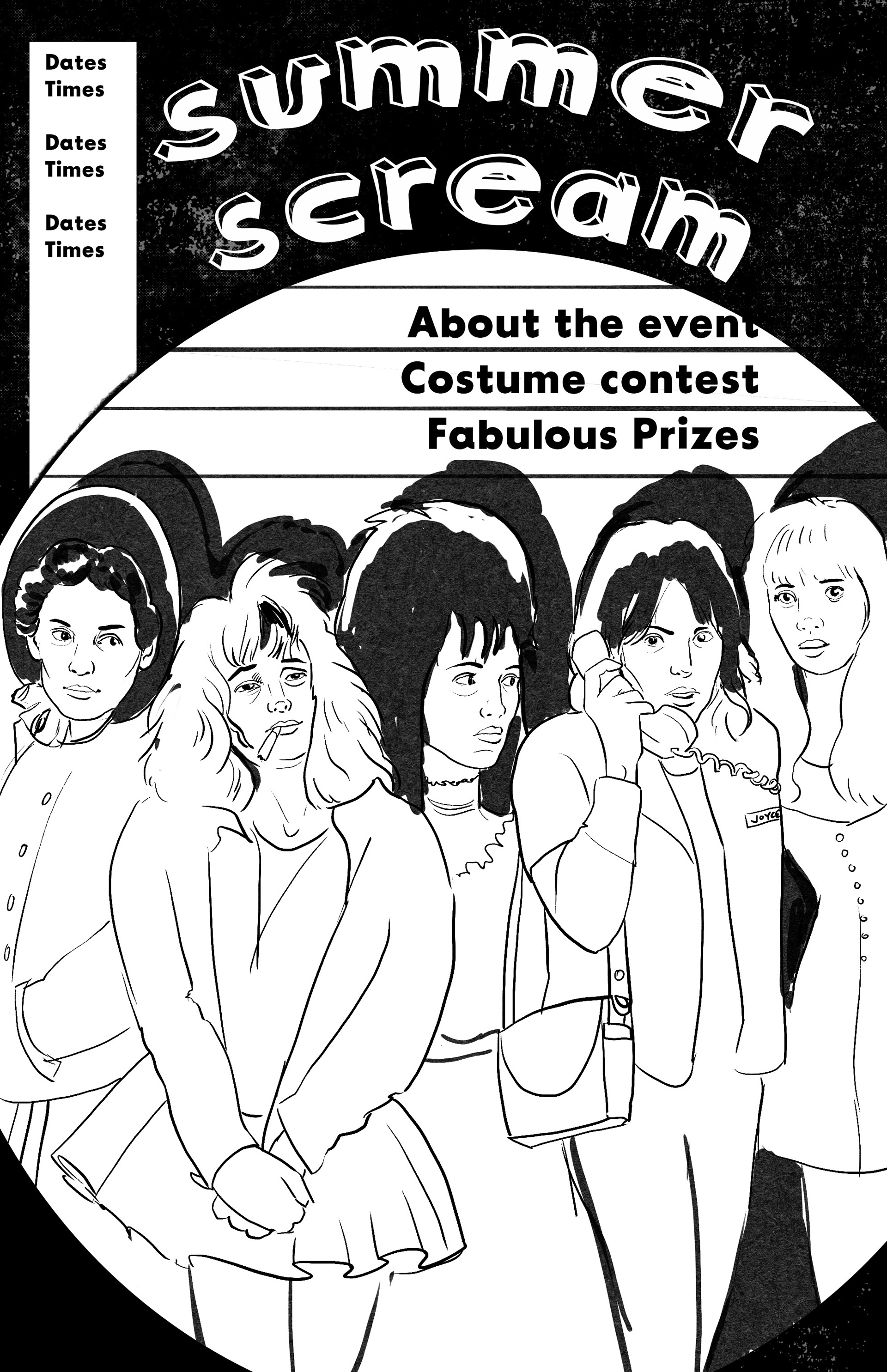
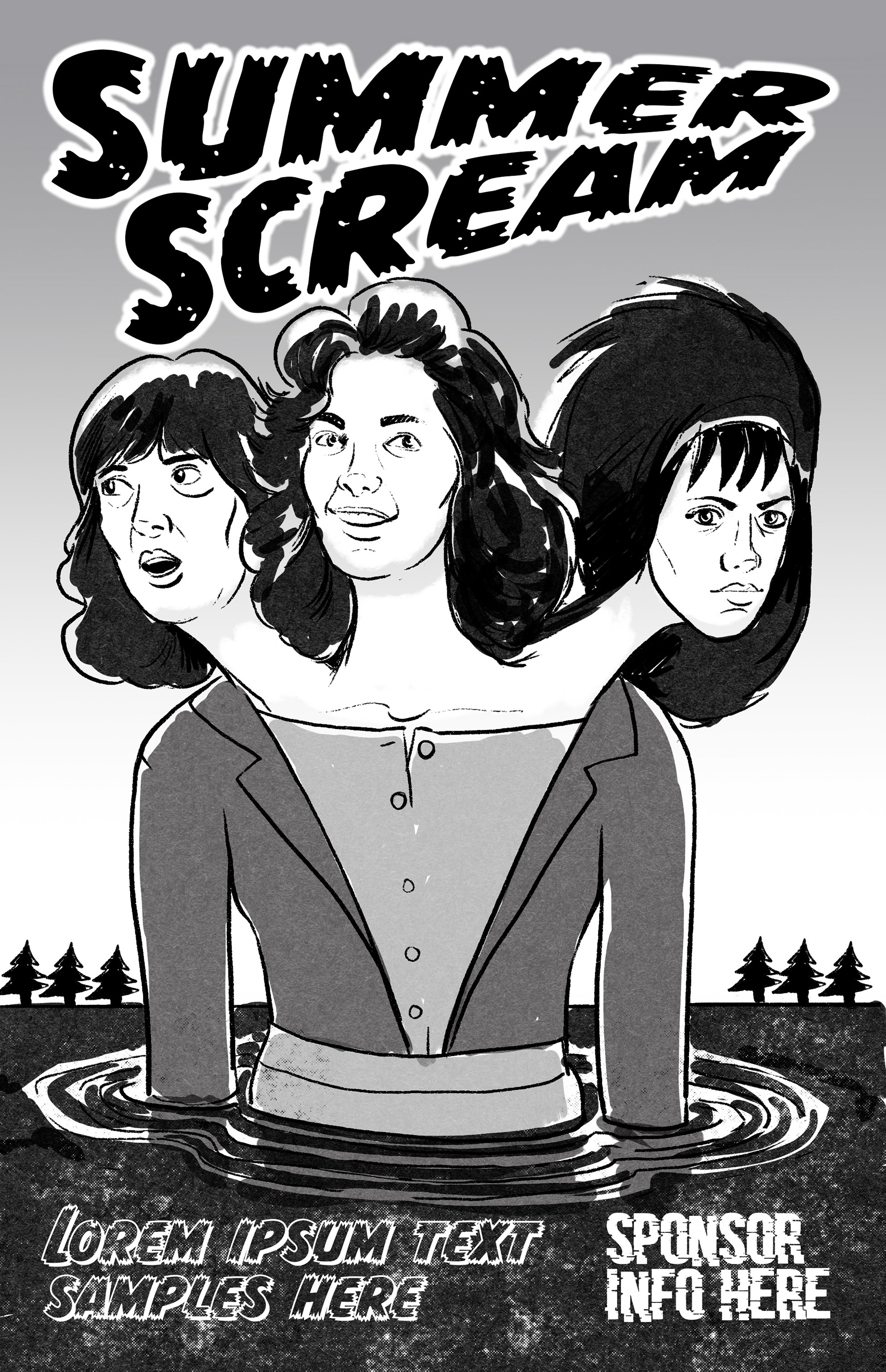
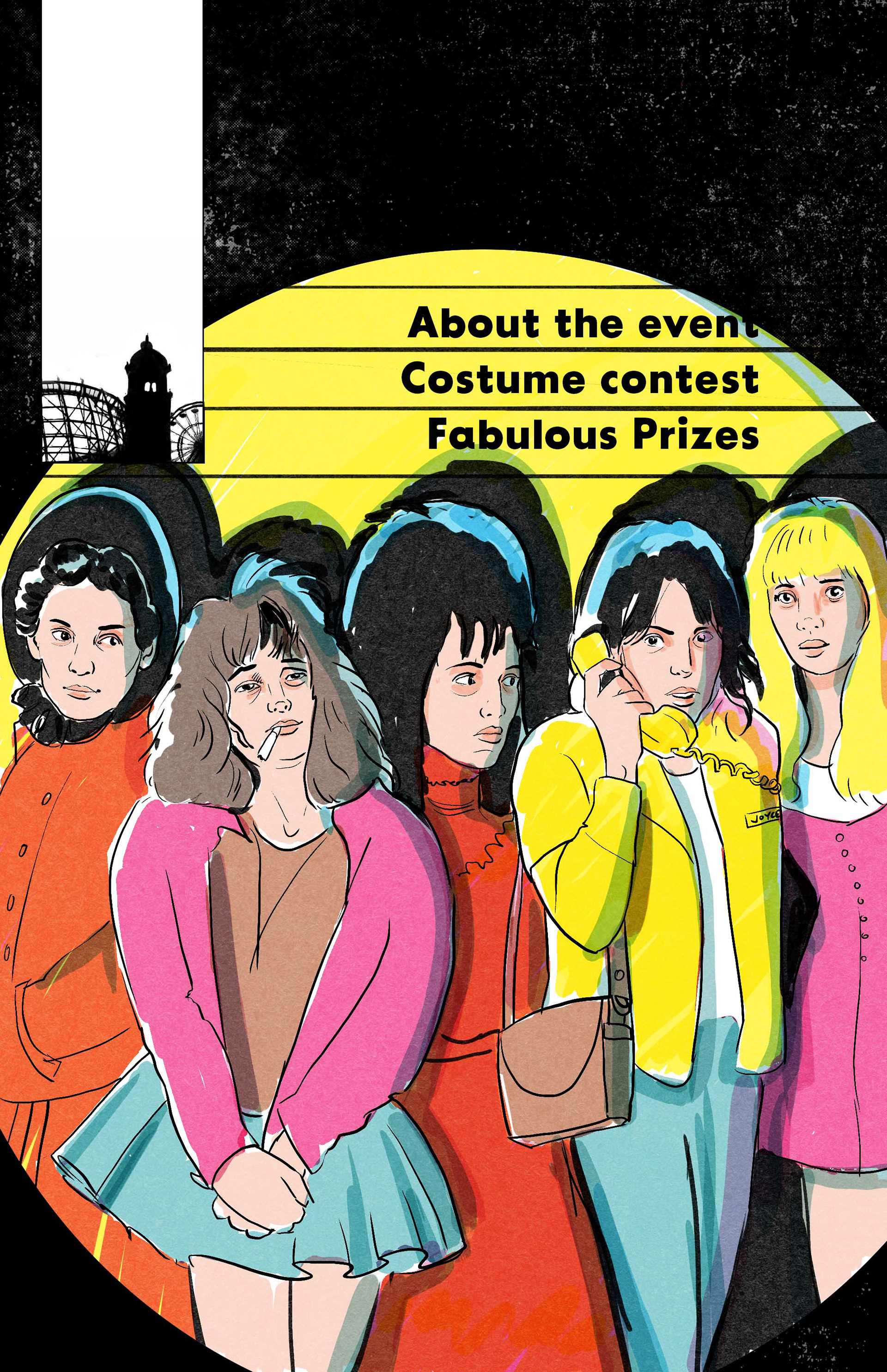
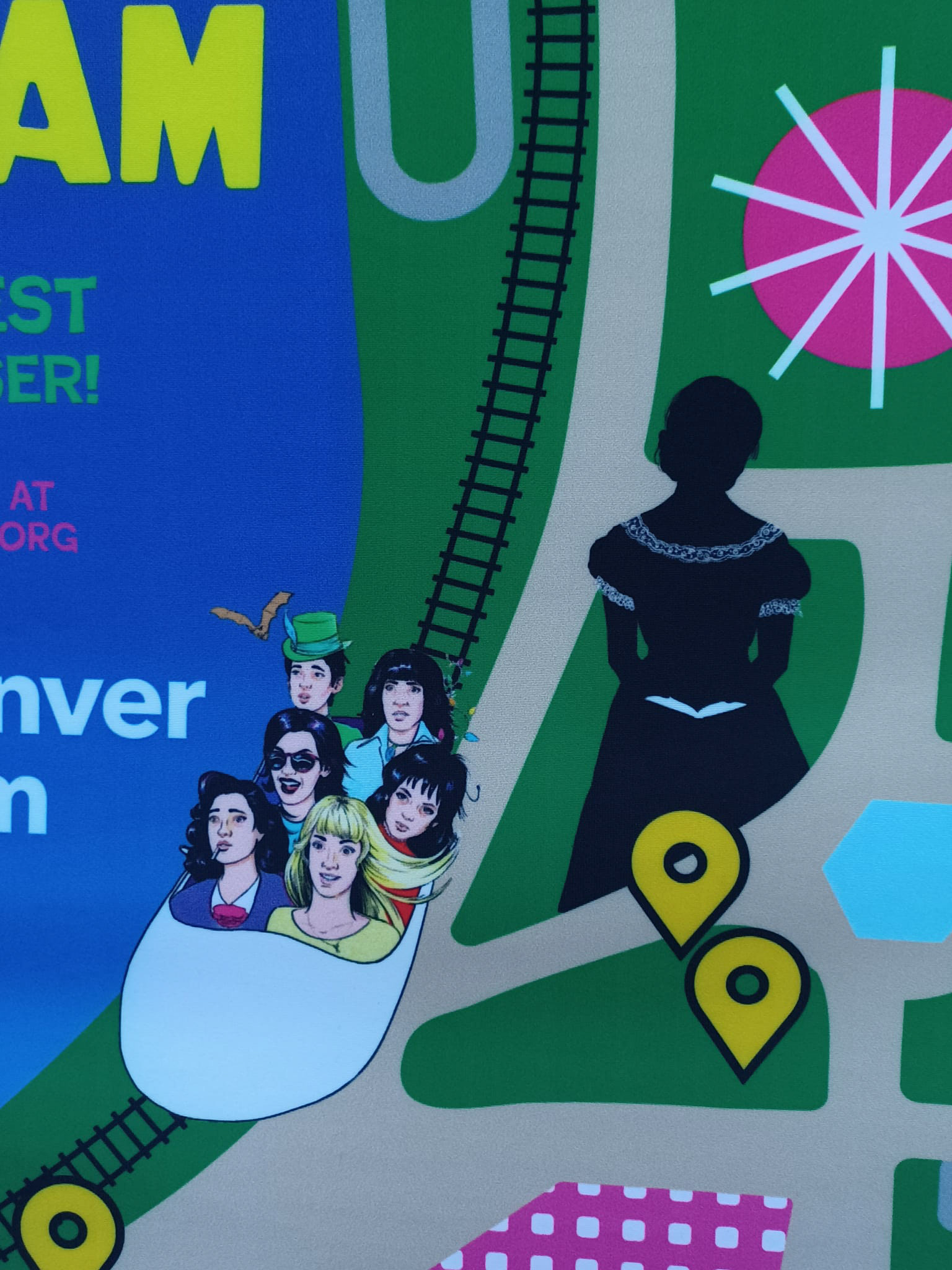
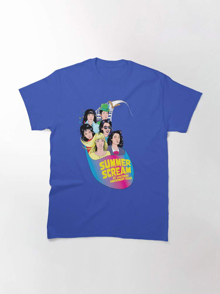
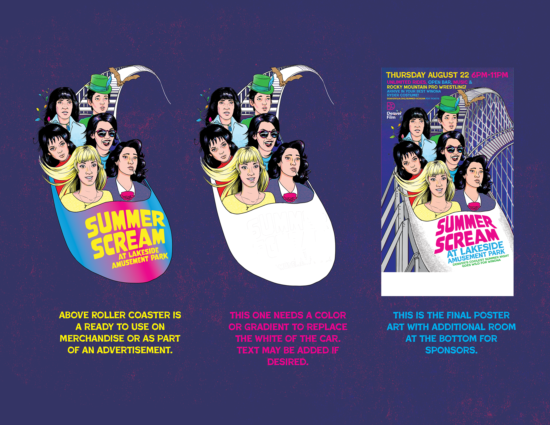
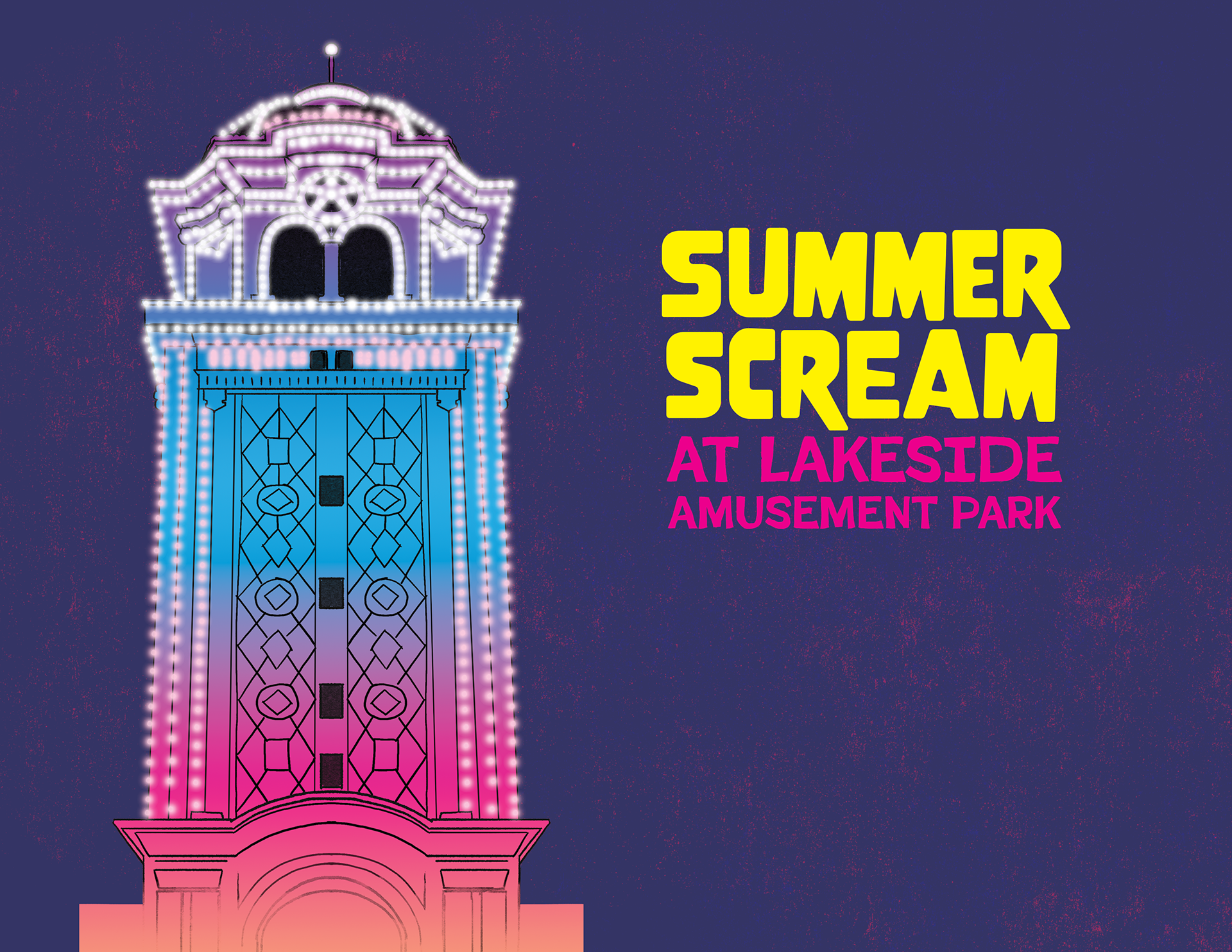
The park liked the sketches, but conveyed that they wanted the final design to include elements of the park such as the original tower entrance and the wooden roller coaster. I came up with the idea of several Winona Ryders riding a roller coaster. The park loved this idea. Below is the sketch, pencil, and ink.
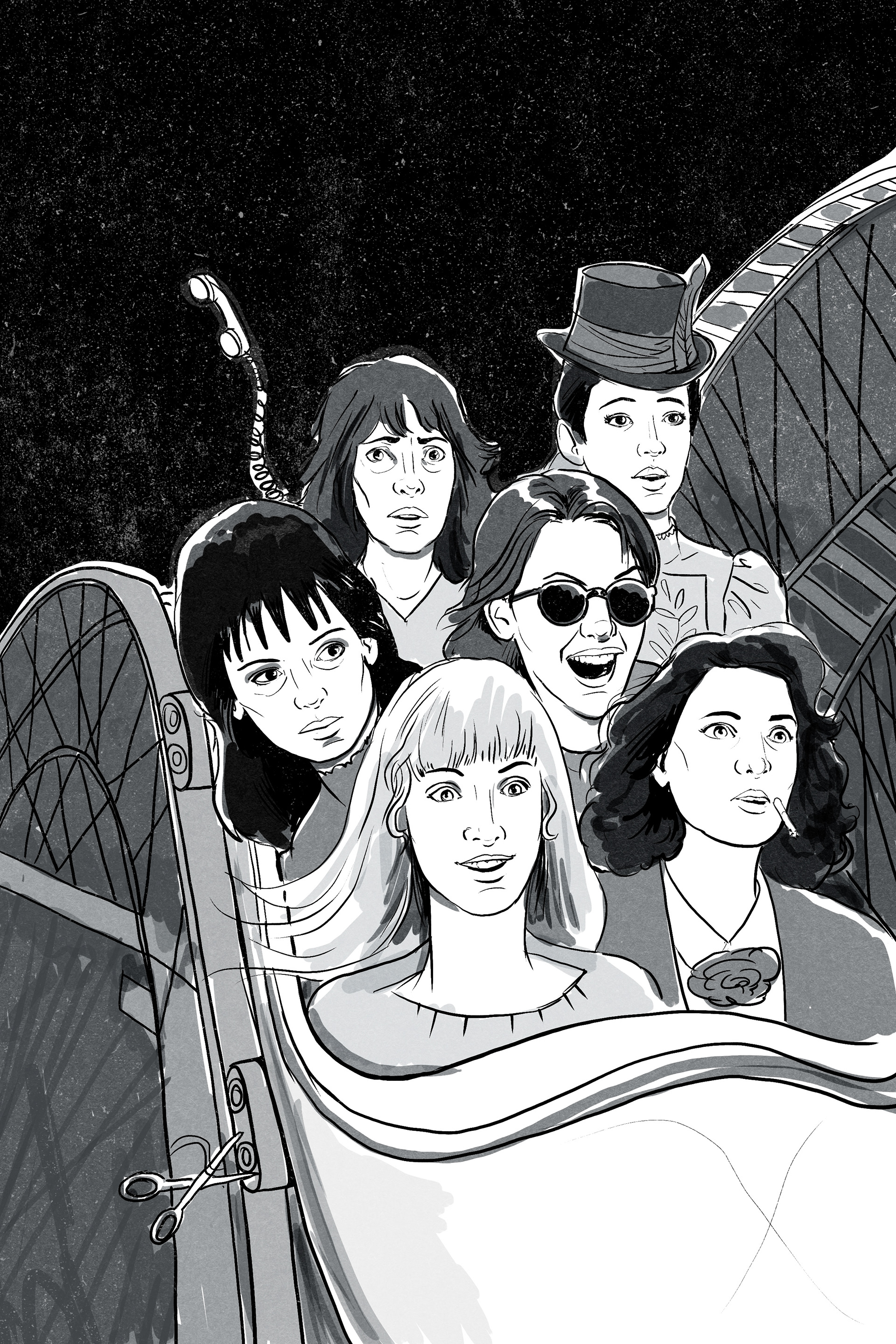
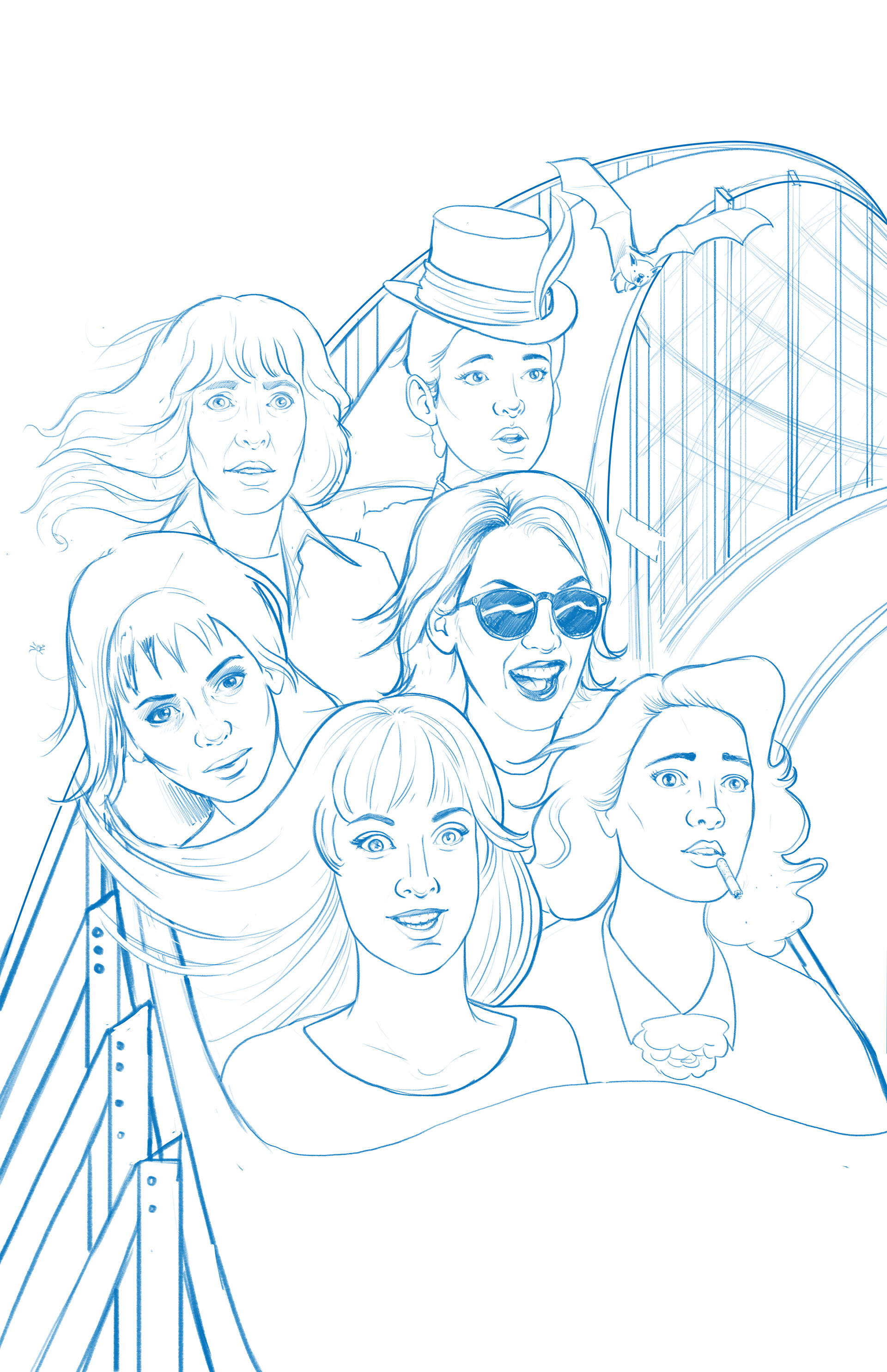
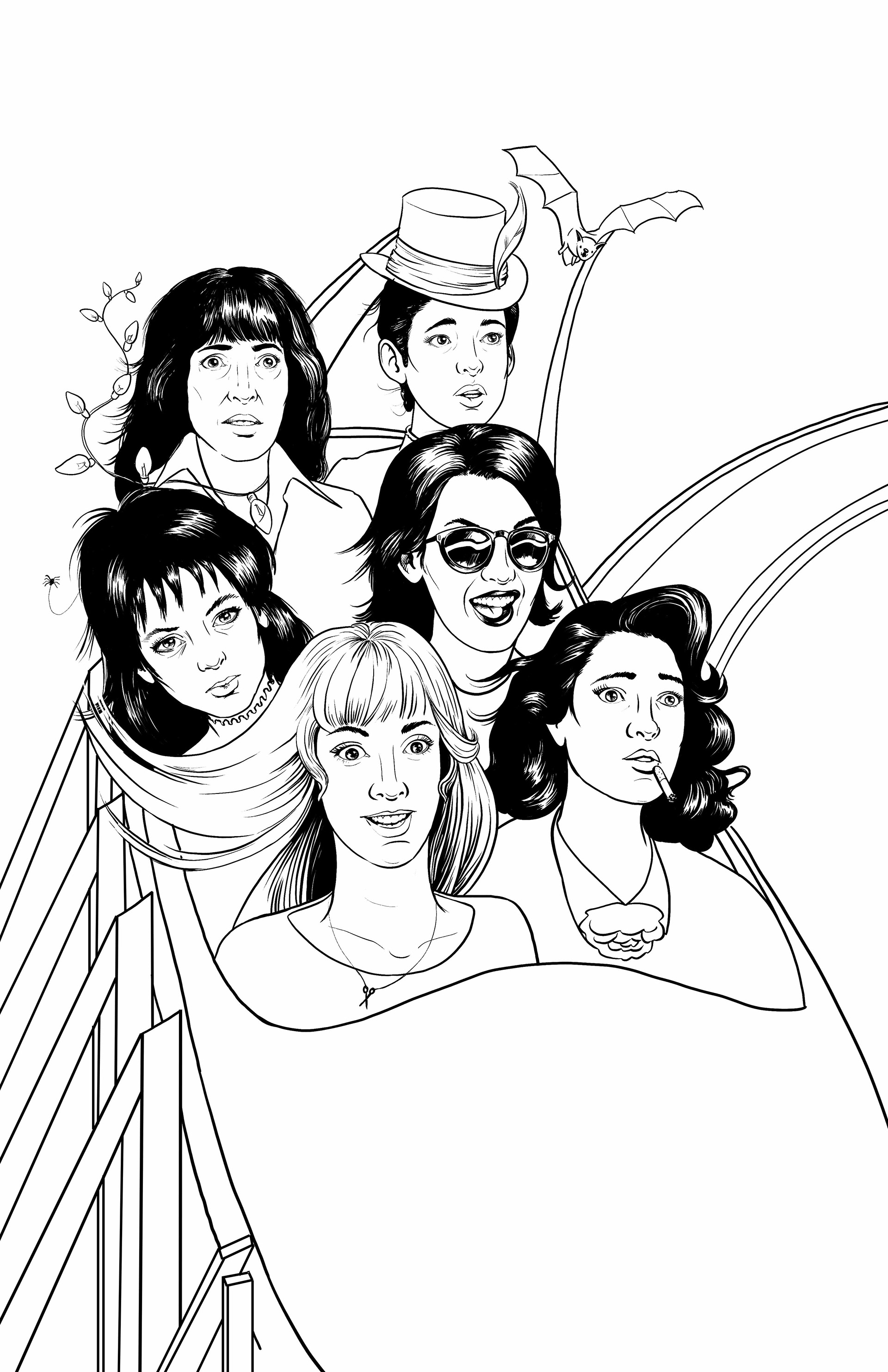
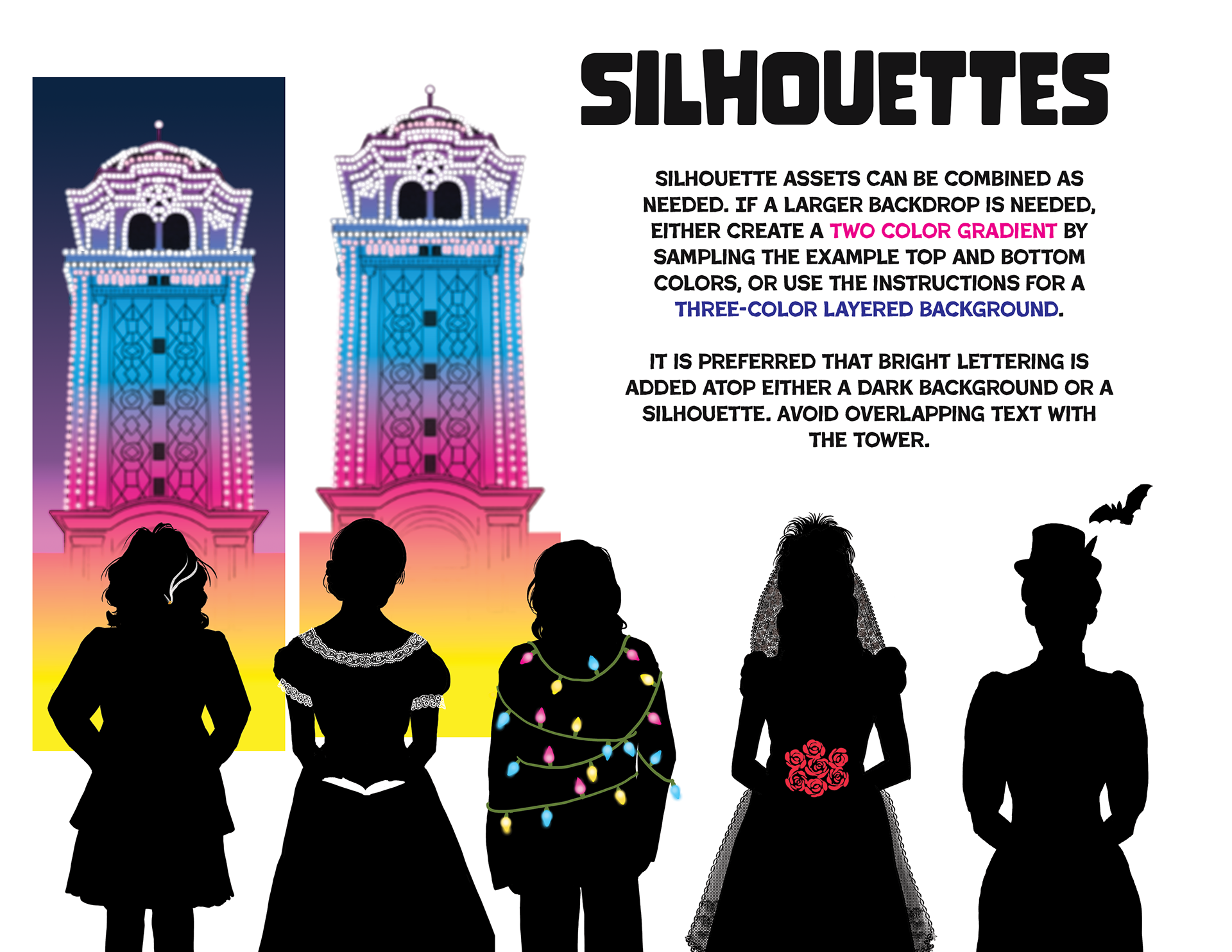
The client also wanted some sample ads that the park would publish on different social media and also as banners around the park. They were fuzzy on the final uses. I created some flexible design elements and made some sample Instragram and newspaper column ads using the fonts and elements selected by the park and in their selected palette of risograph colors.
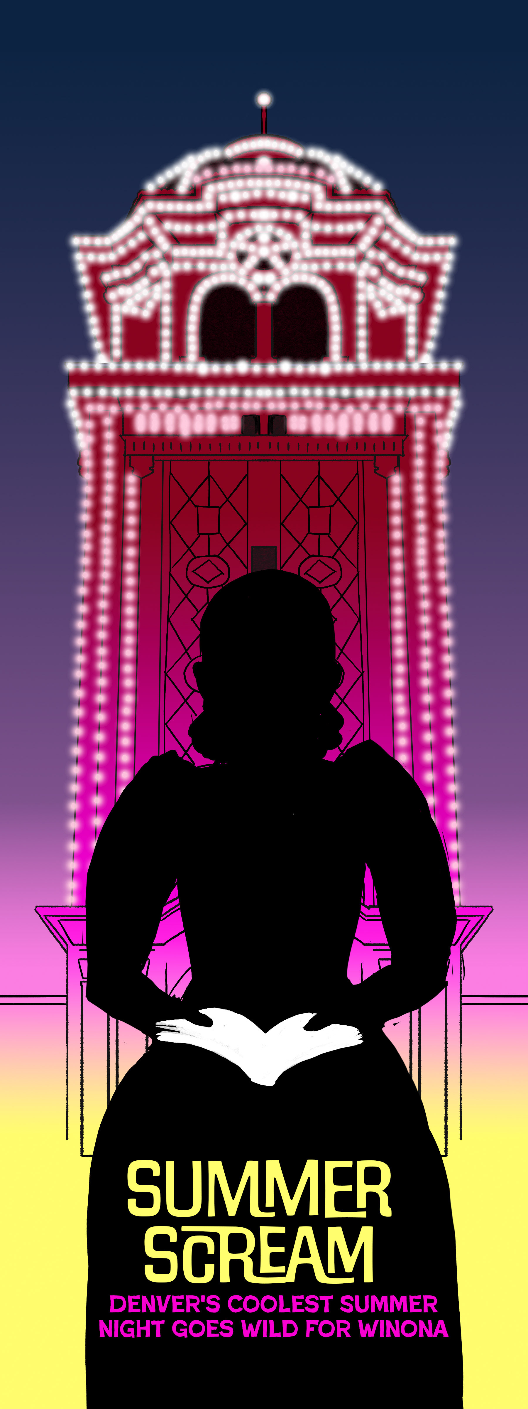
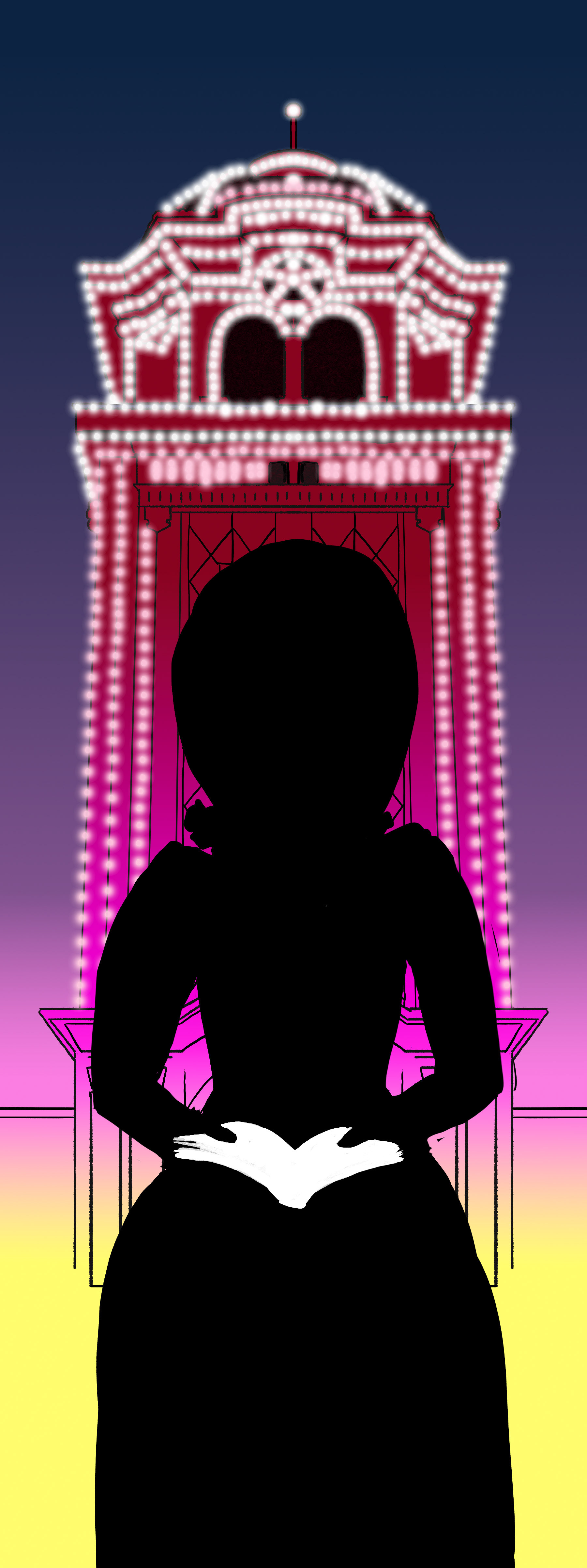
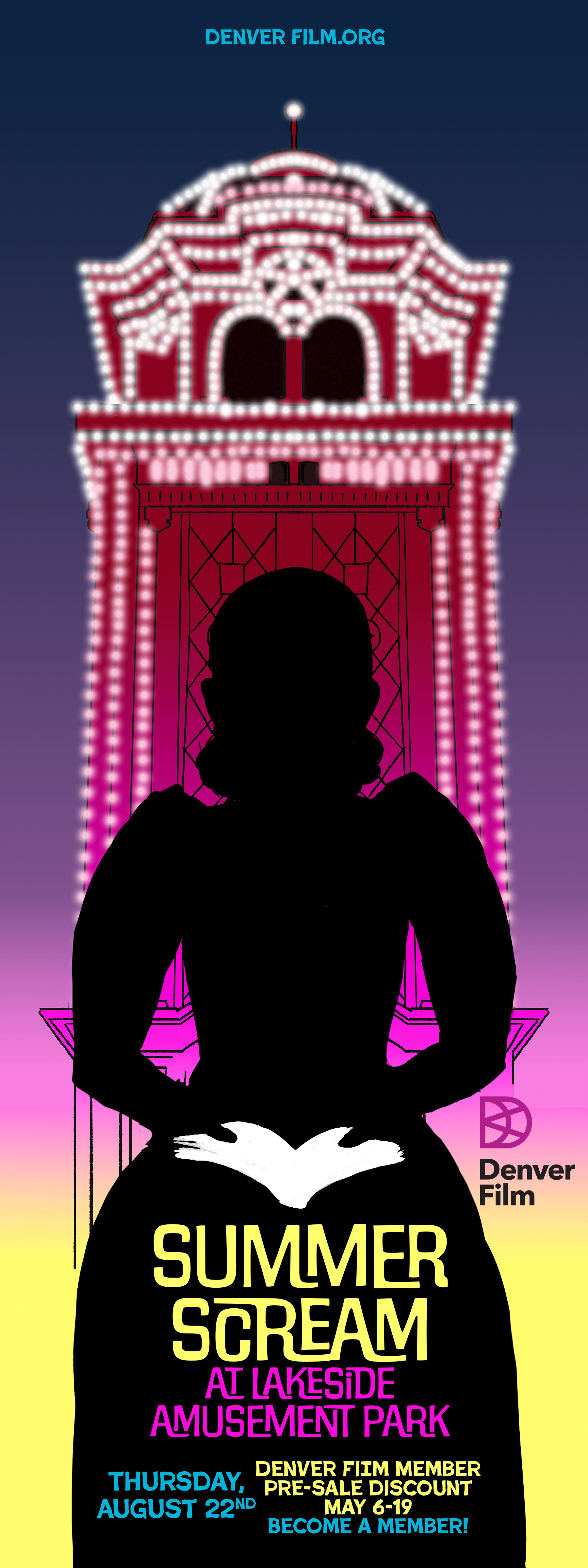

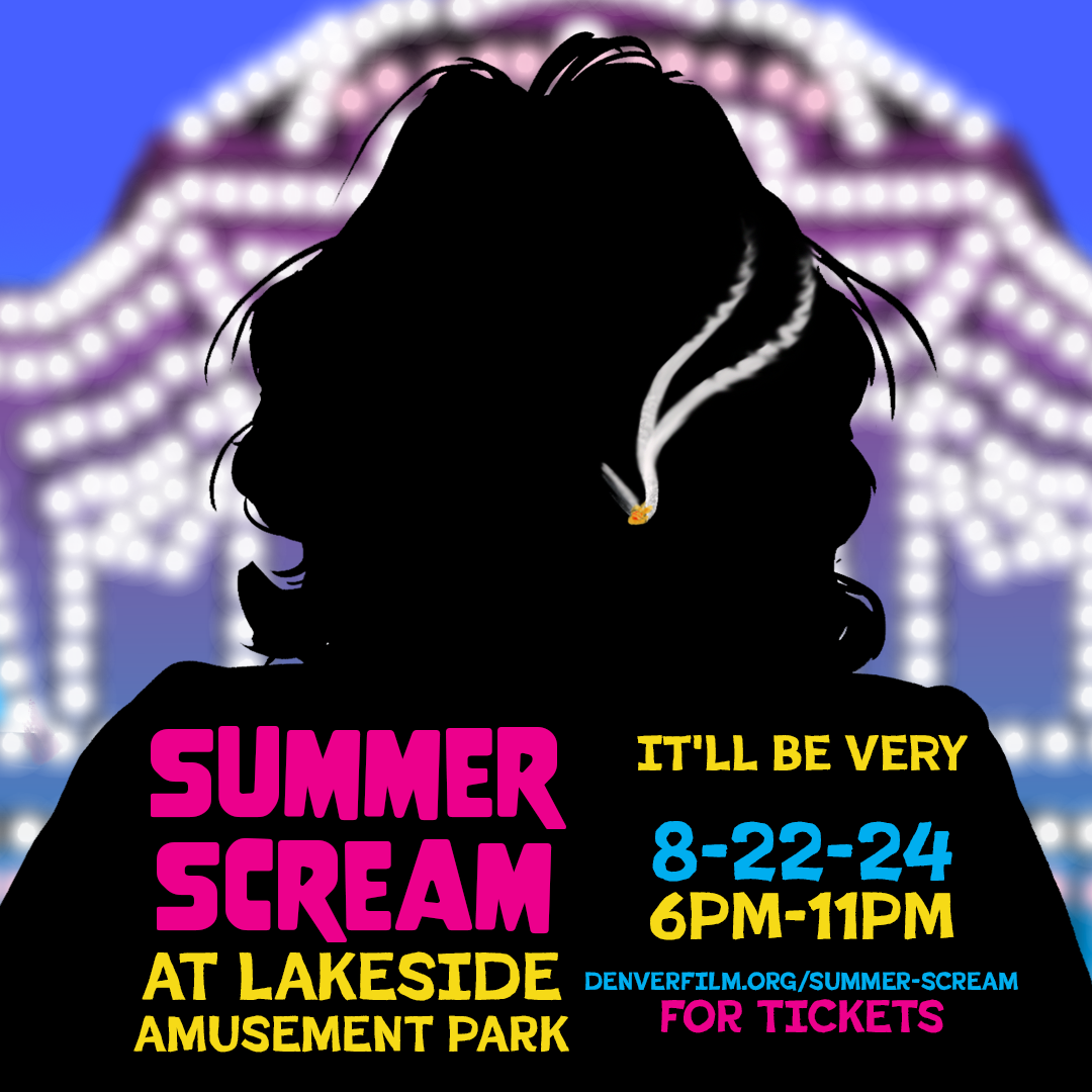
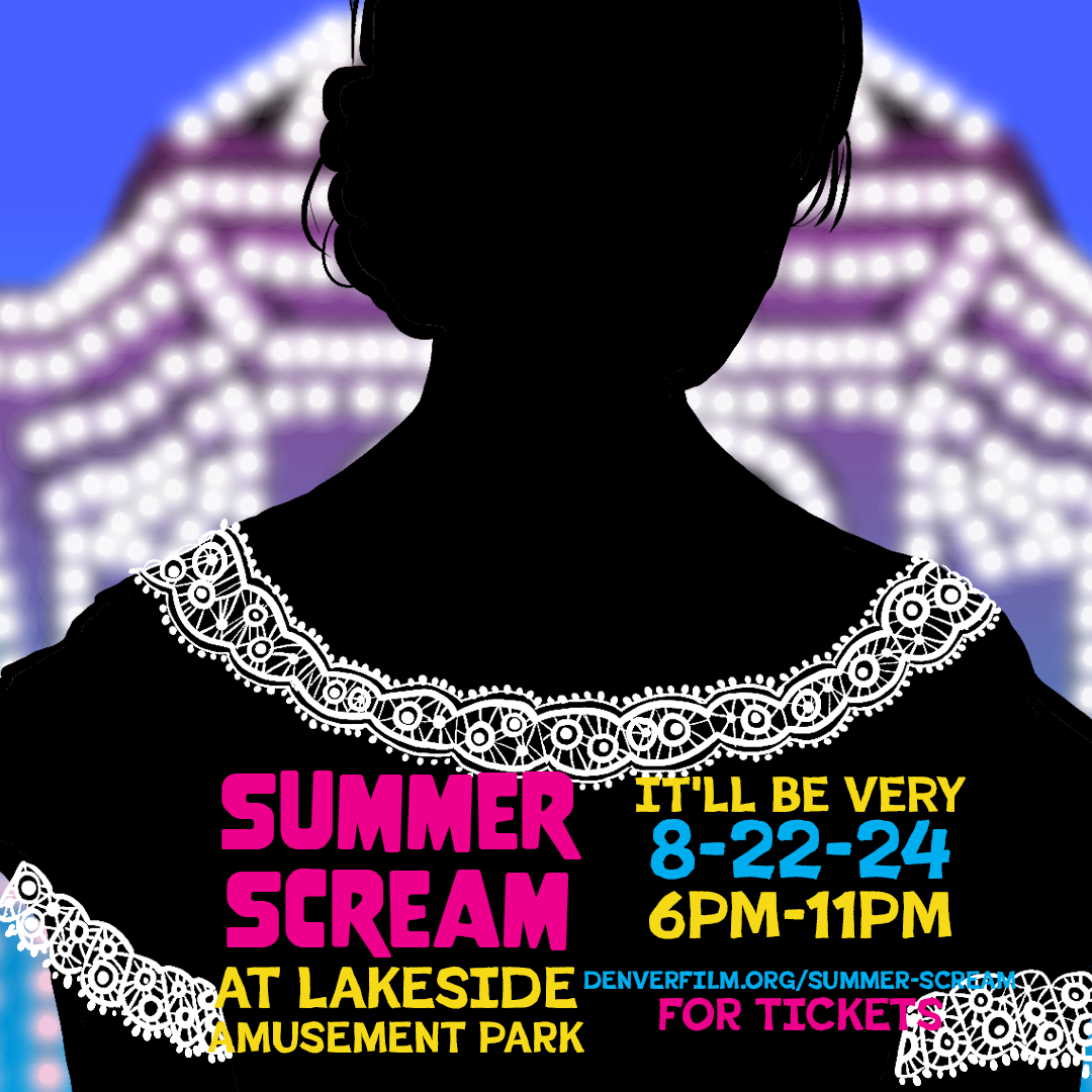
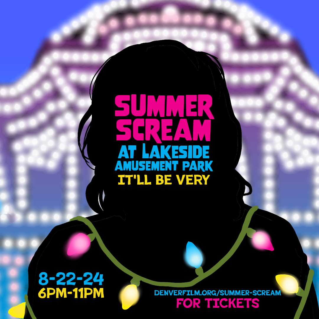
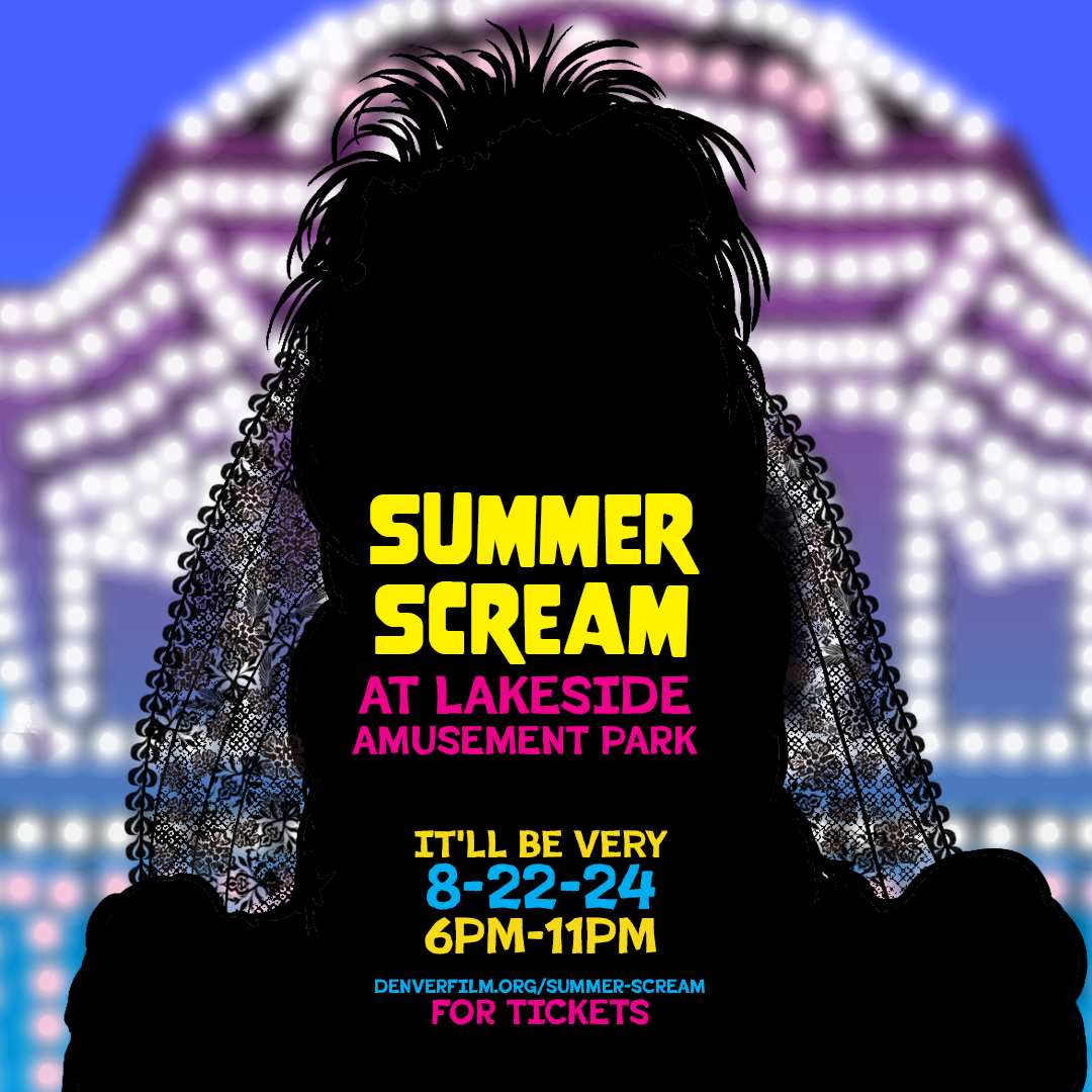
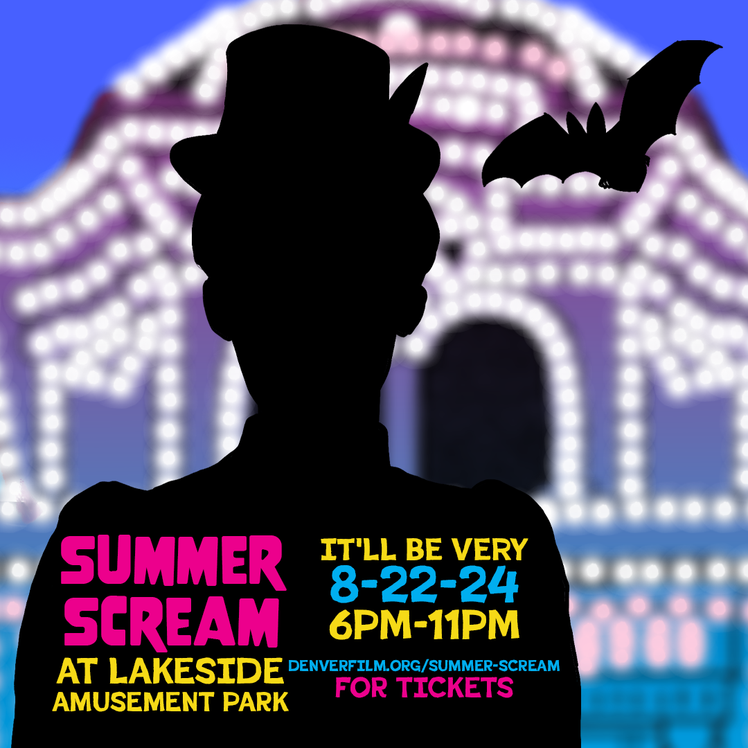
The park then asked us to create some sample merchandise using the font and design elements. They were very insistent that this should include socks, so I had to research best practices for sock design.
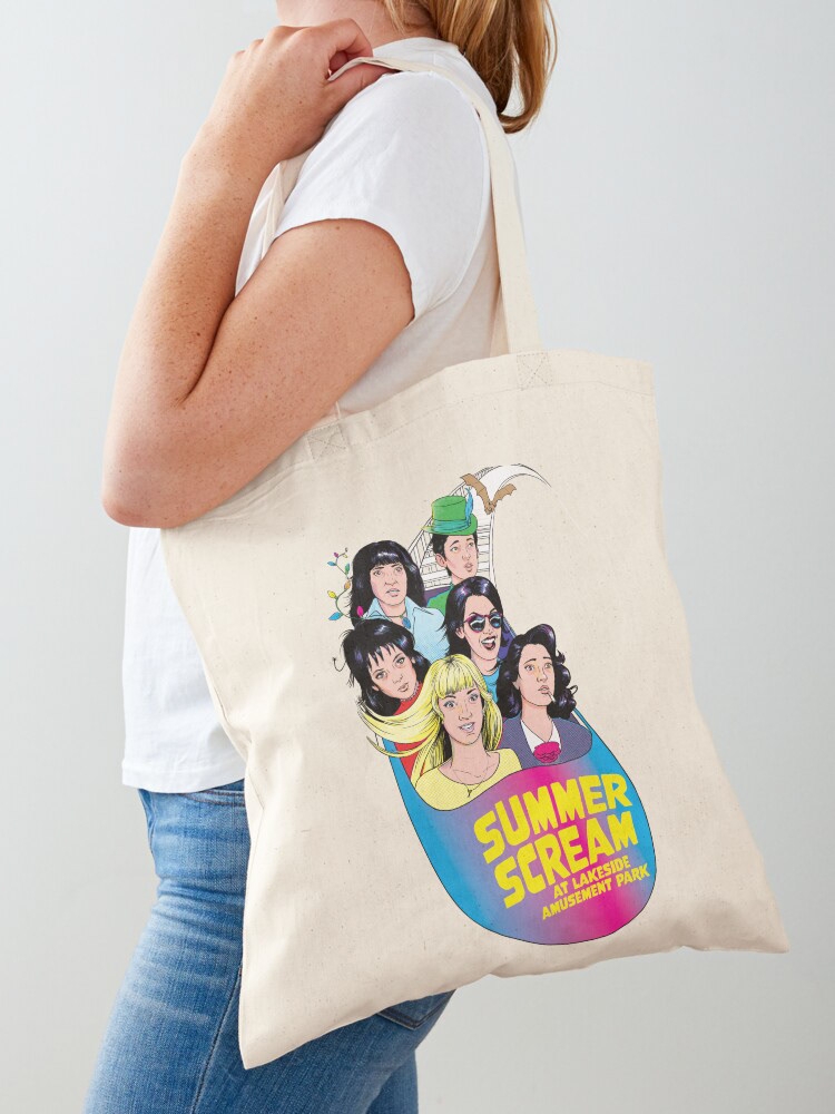
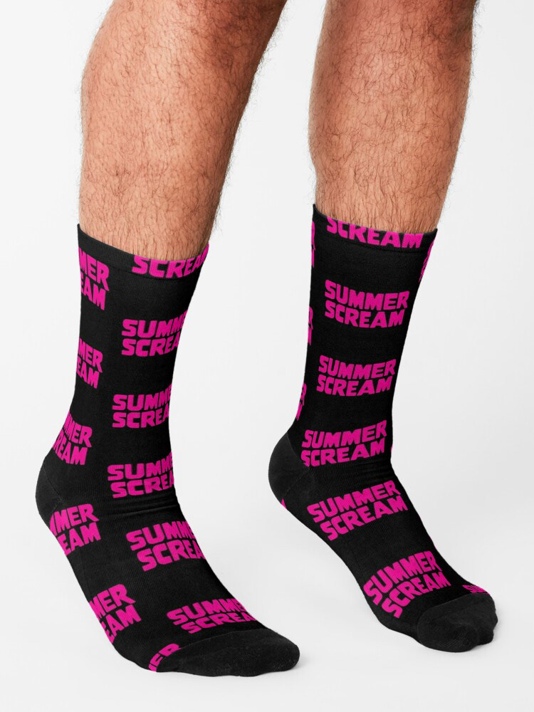
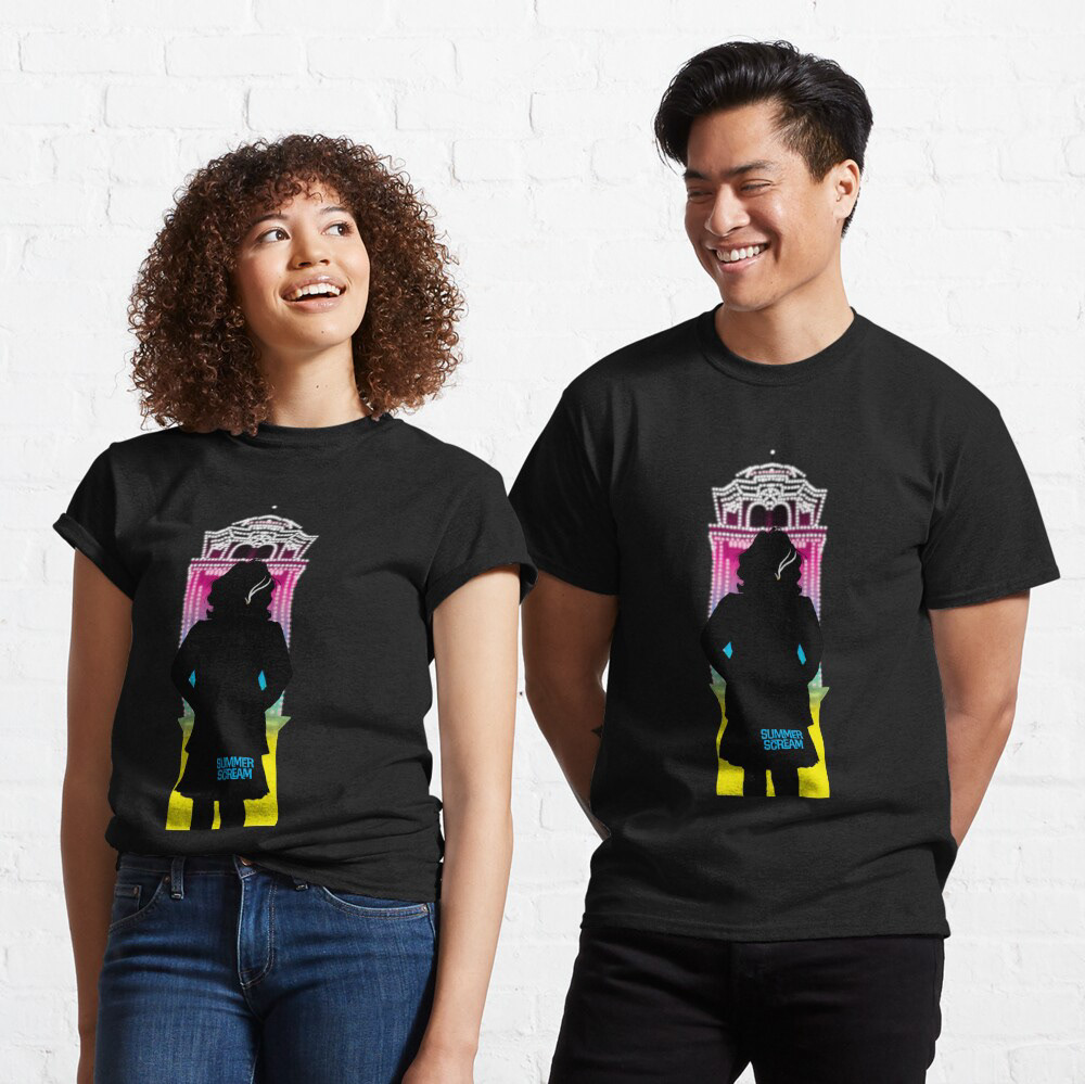
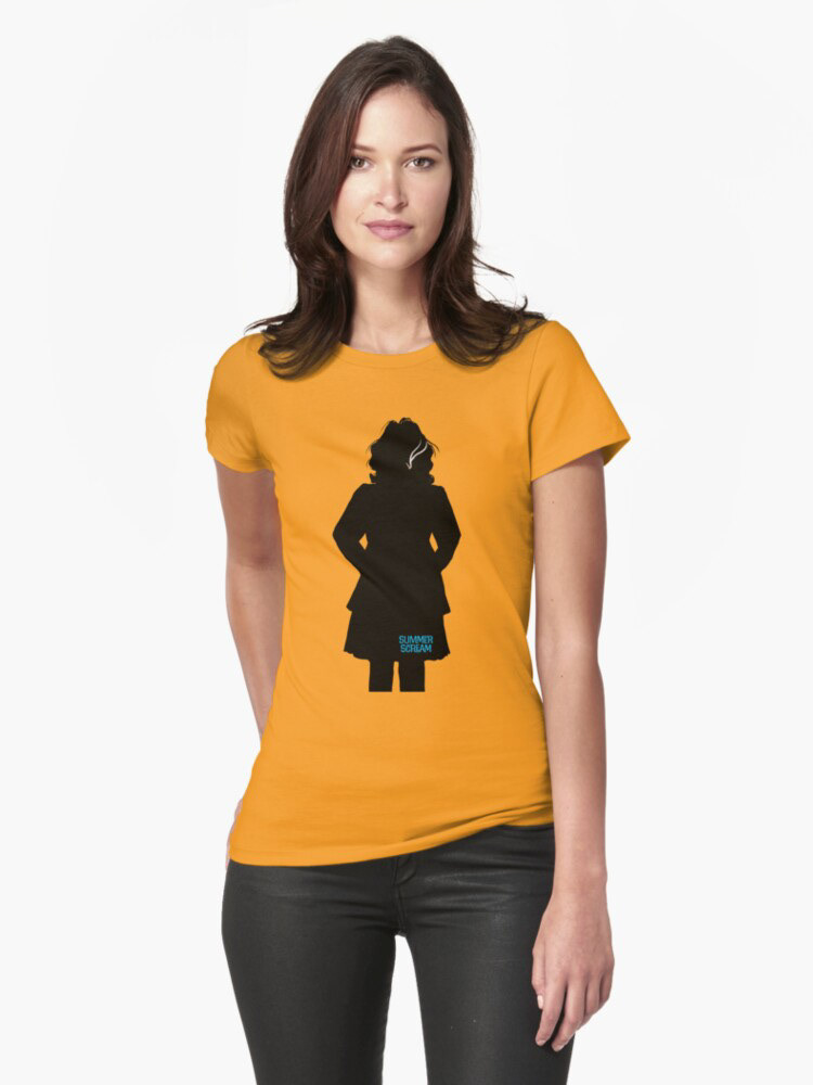
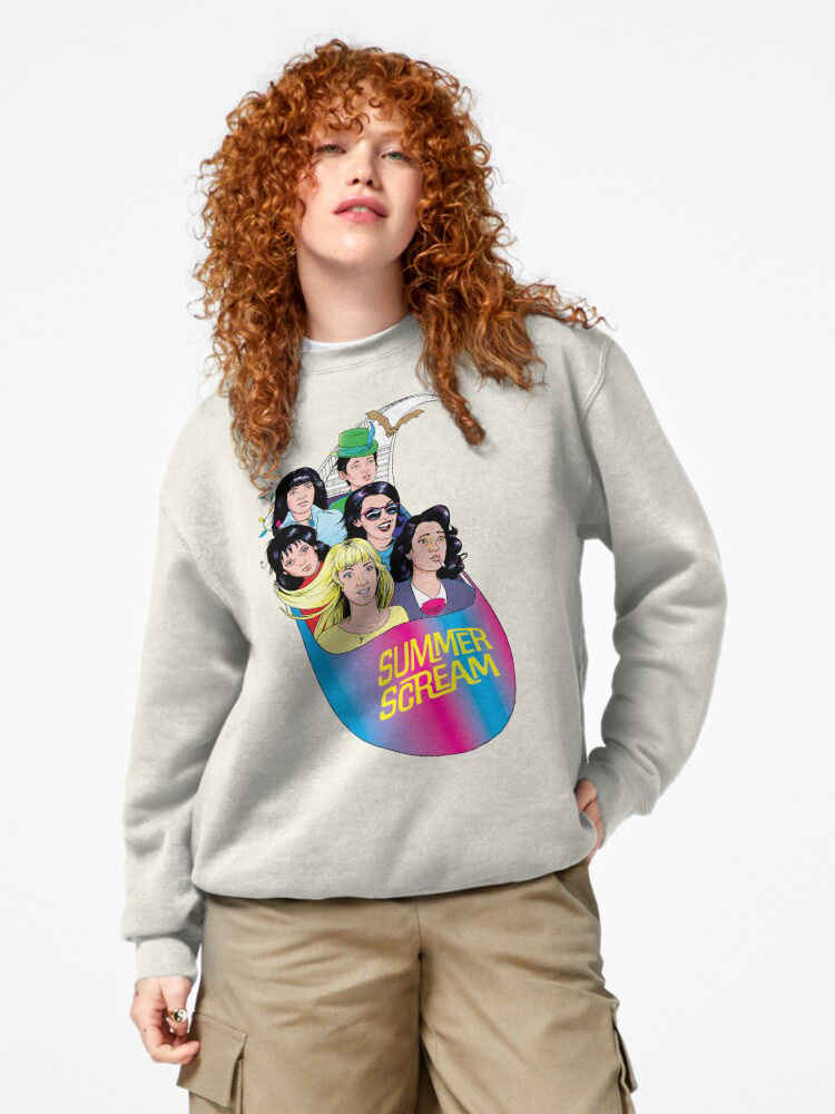
The client then wanted some temporary tattoo art.
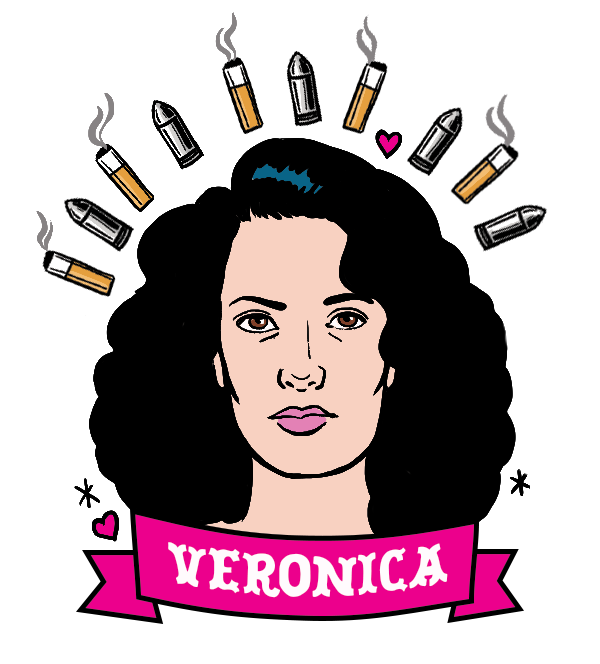
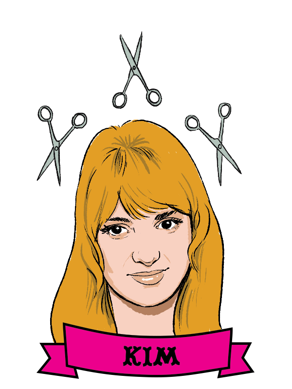
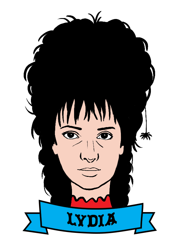
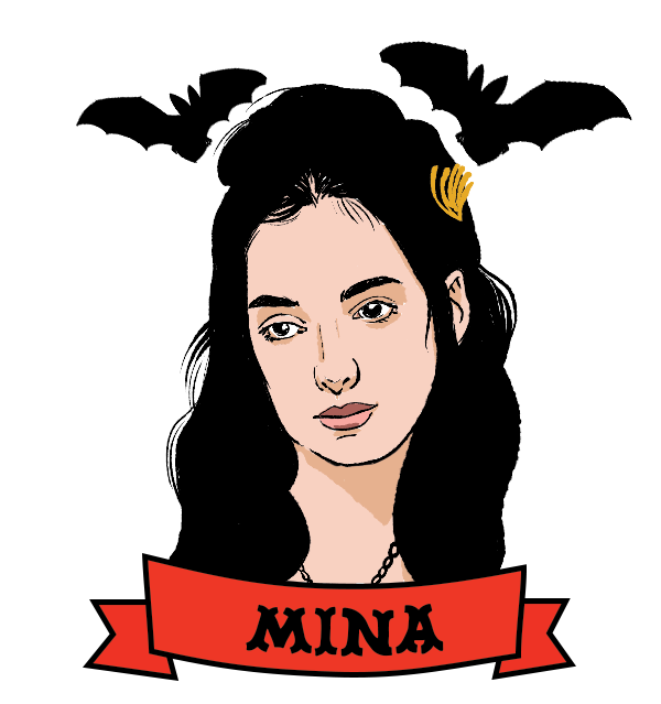
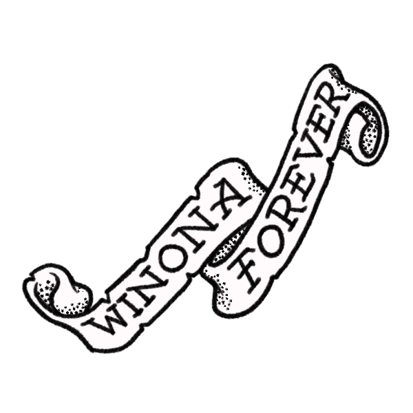
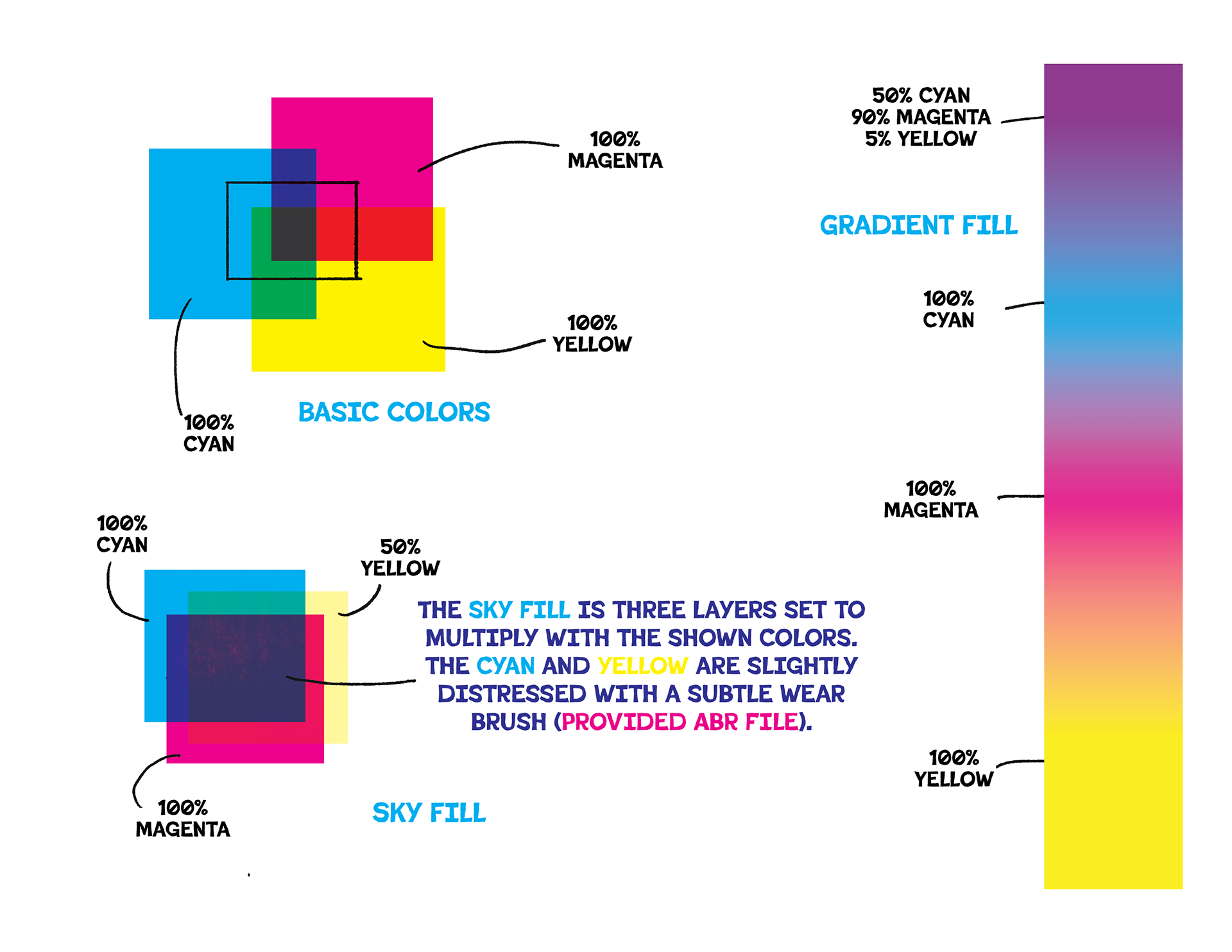
They asked me to put all of this together in a "style guide". I provided files of all of the final art, both in PSD form, as well as each of the layered elements as transparent PNGs for ease of use. Included in the package were brushes that I used to create the distressed background and the files for the fonts.

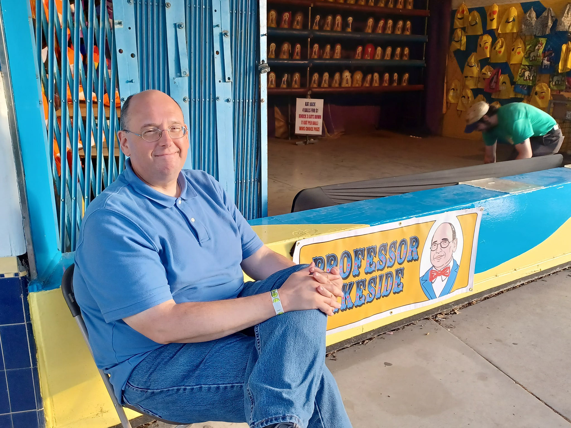
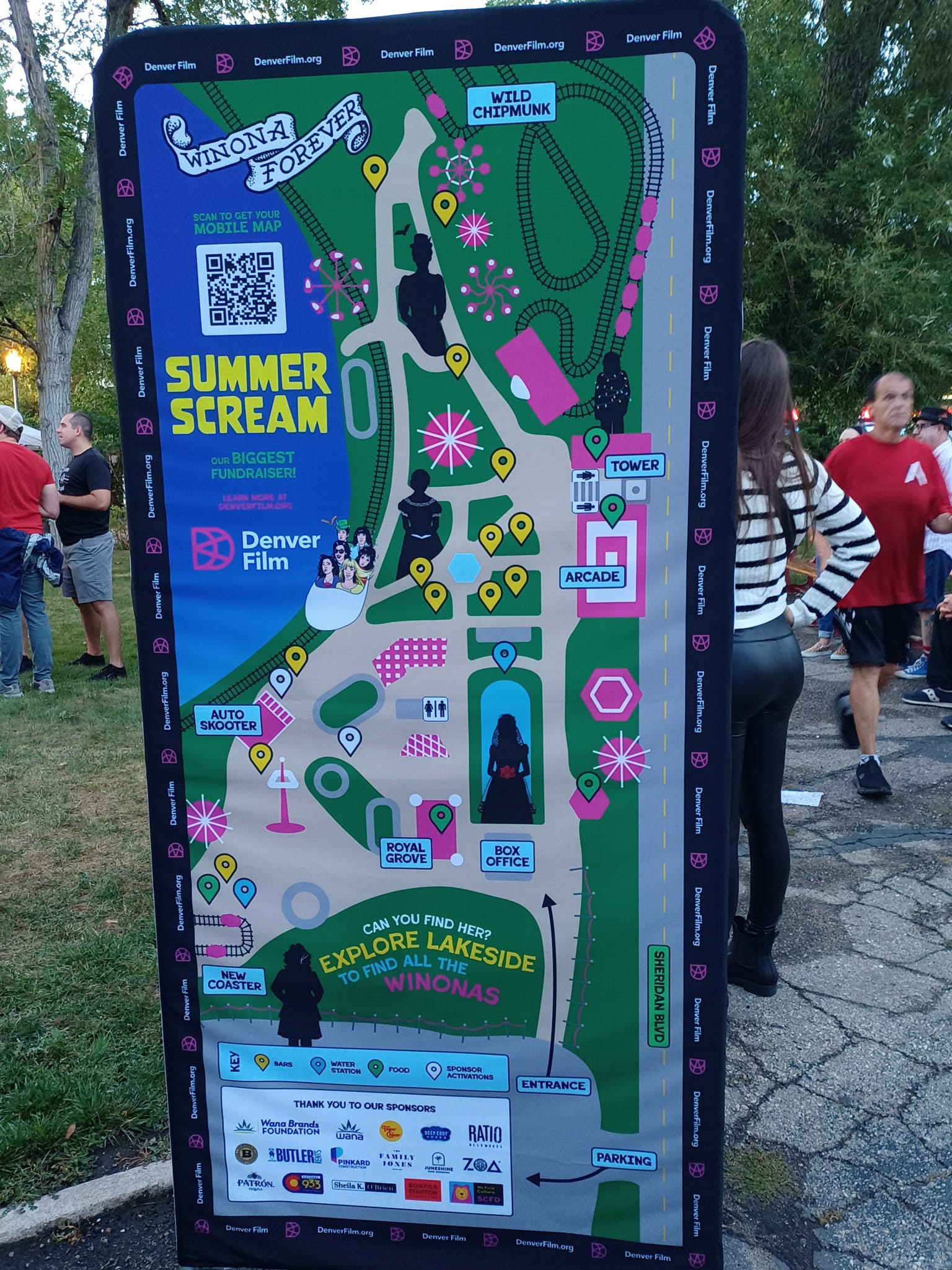
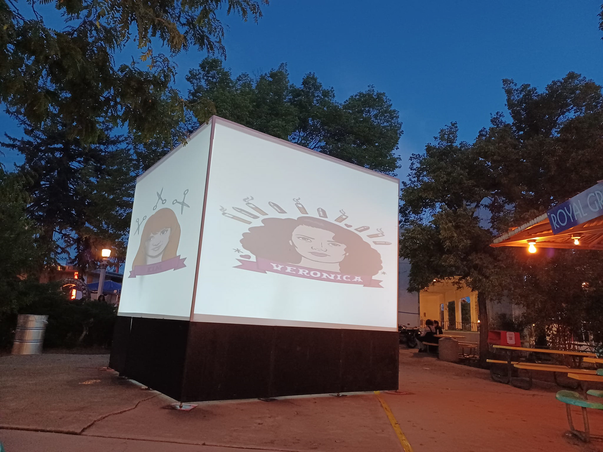
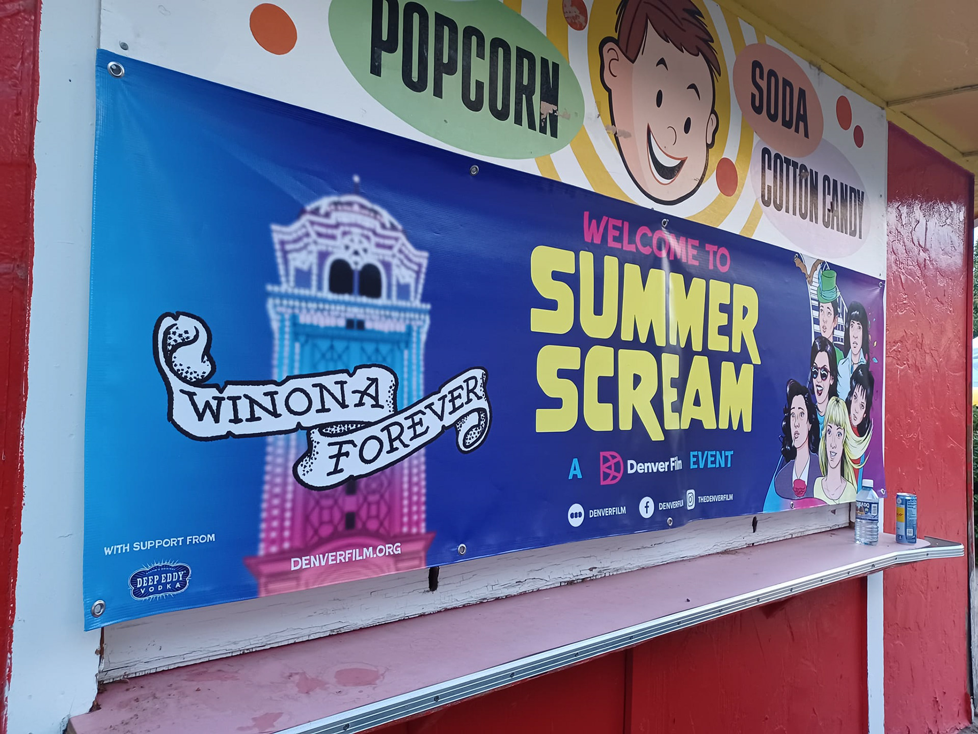
Here are some images that I took at the park on the day of the event. The banner designs and element usage were all the work of the park's in-house graphic design team. I also did a last-minute banner for Professor Lakeside as part of an alternate reality game for VIP members.
